THE CHALLENGE
As VialSource decided to dive into the primary school market (kindergarten – 12th grade), a wealth of new design challenges presented themselves. We were developing student facing apps would have to work for users with a wide range of abilities. To better serve these students, I presented the idea to create themes that were determined by age group. Thus we created similar, but different apps for K – 4, 5 – 8, and 9 – 12. However, for this portfolio piece I am going to focus on the youngest group, and a very unique challenge: how can a child, that has barely begun to read, log into an app? VitalSource has thousands of books from hundreds of publishers, and they all have strict DRM protocols to adhere to, including the children’s content, so it had to be secure, but also very easy and friendly.
IDEATION
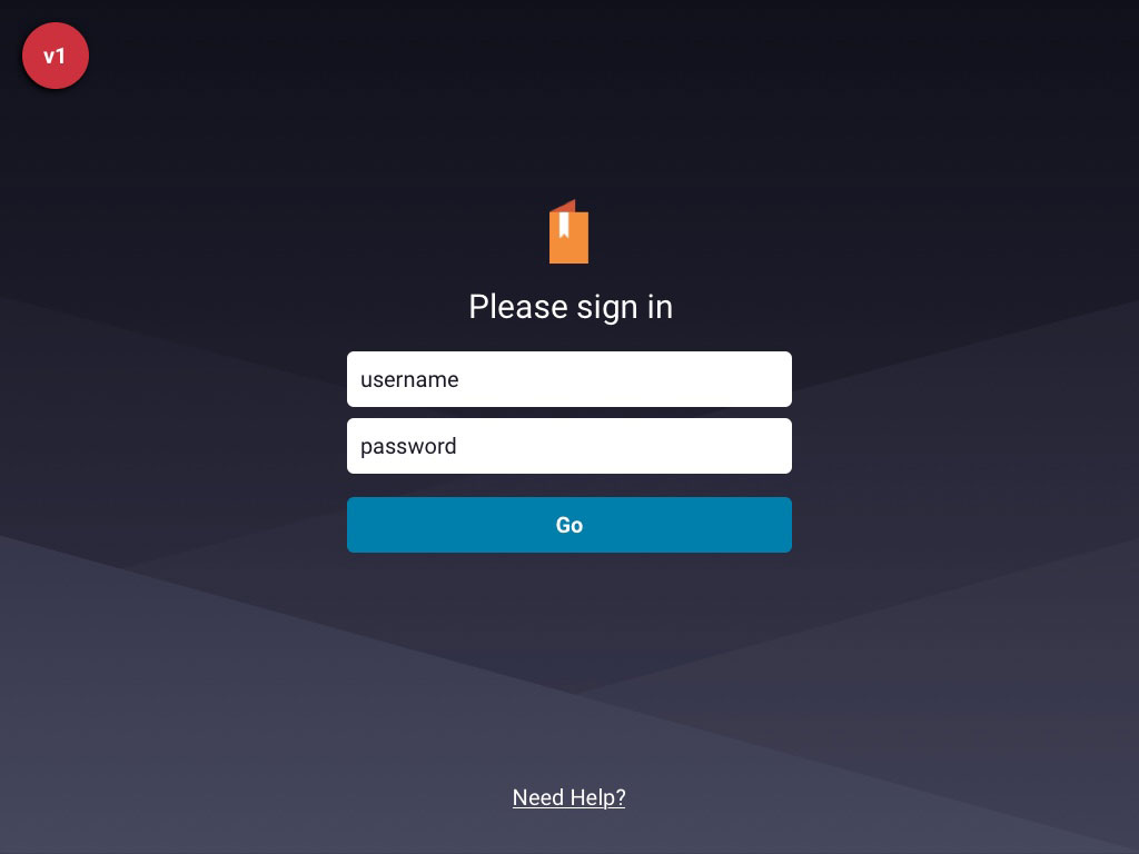
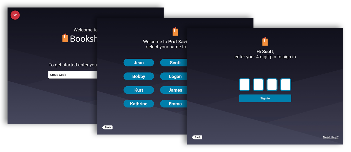
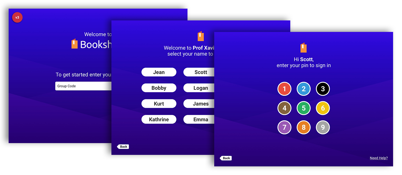
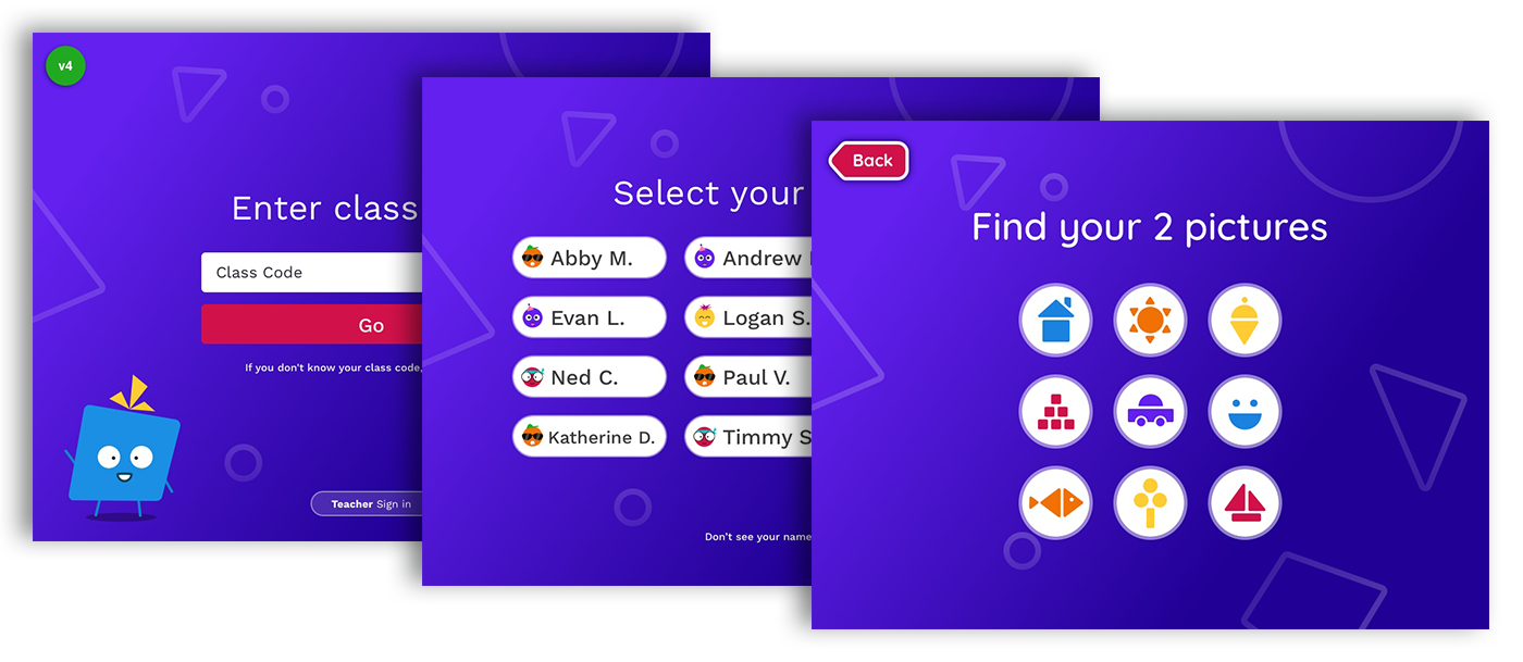
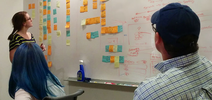
A log in screen is merely a field for user name and password, right? But what if you’re user is 7 years old? I presented this question to my team, and we meticulously built and tore down many ideas. The below 4 versions show some of the milestones in our thought process. Version #1 — Your standard two fields; this required typing with a keyboard and remembering both a user name and password. Version #2 — This first breakthrough was the idea of a “group” code. This would be a unique string that identified a school and class. Since this string was long, we could simplify the subsequent steps, and allow the child to simply select their name, and then enter only a 4-digit pin. The combination of these three steps was strong enough for our DRM concerns (and our security team agreed). You might be thinking, “how would a child remember this group code? What a failure!” Well, our research taught us that this was inconsequential. While interviewing teachers and parents we determined that an adult would always be with the student for there initial setup. Knowing this gave us some leeway. So we added tools to the accompanying teacher portal to help teachers with their classes first log in, and created a cheat sheets they could give parents. Finally, we’d only ask students for their group code initially, and then cache it. Version #3 — In this version we ultimately eliminated the keyboard by placing a number pad directly in the interface. I read an article about how children learned associations before letters and numbers. So rather than just a black & white number pad, we paired each number with a color. Version #4 — After looking more into how children begin to learn and remember things, we gave the final solution objects instead of number in the keypad.
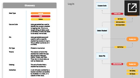
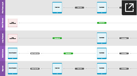
Once it was determined how the log in flow would work, it was important to map out the architecture. The first IA document below shows the funnel a user goes down while logging in, and the information our system would look up and verify along the way. Keeping in mind that the group code was not something we intended children to remember, it was important to avoid the need for it whenever possible (while staying secure). The other document below maps out how users would sign in for the first time, sign in if the device timed out, switch users (if the device was shared in a classroom), and sign out completely.
VISUAL DESIGN
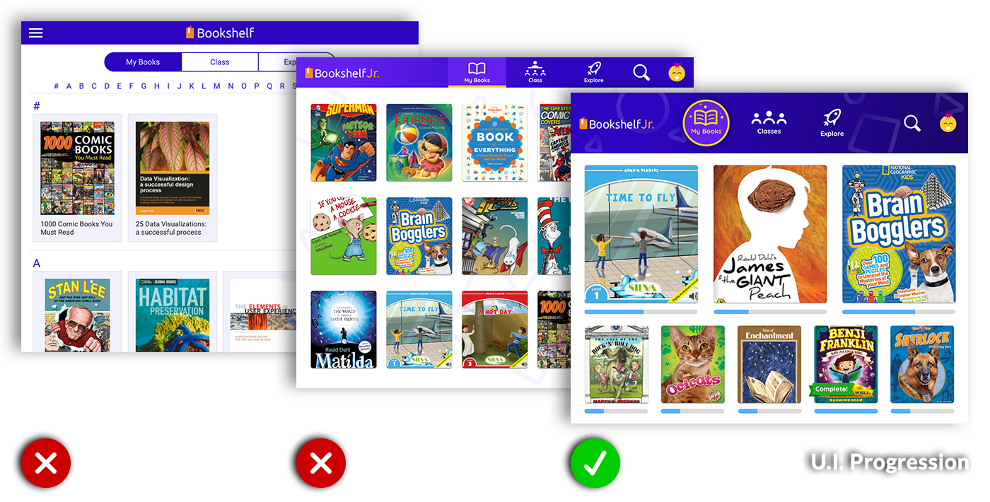
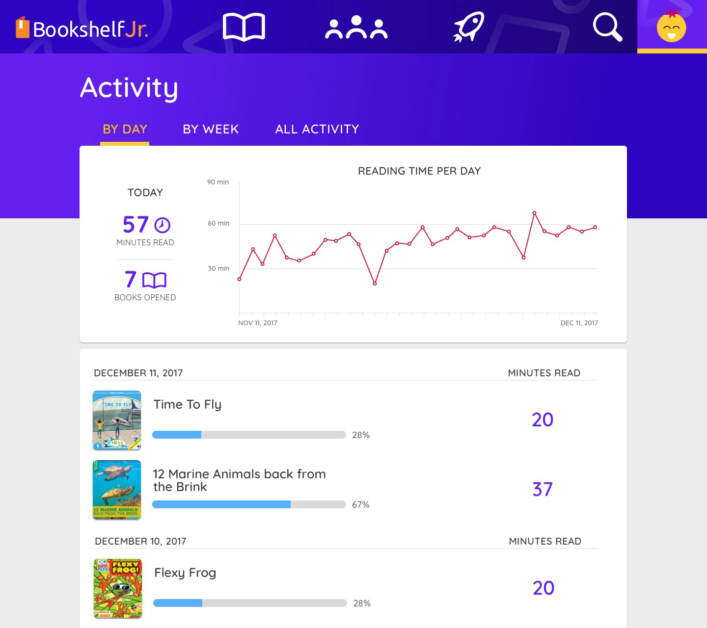
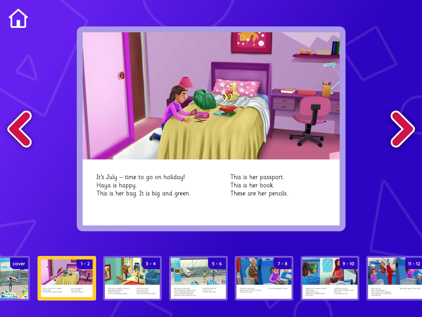
The interface design of this app was really a fun opportunity to try something new. We chose a bright, and high contrast color palette that encompassed much of the app. The fonts used are rounded and chunky, as well as the iconography. Much of the interface is layered with nice shadows, background shapes, and the buttons are large and easy to touch. One really fun and important aspect was the addition of a mascot, Bo. Aside from adding to the visual playfulness, Bo would actually show up during on boarding and other places to point out things and help the user understand the interface. The first image below shows the progression of the U.I. for the main library screen.
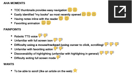
USER TESTING
The VitalSource development team was able to get a functional web prototype together really quickly, which allowed my team the unique opportunity to test it out with children. I’ve don’t many user test, but watching and hearing from 4 – 11 year olds was definitely new. This validated a lot of assumptions we’d made, as well as pointe out some pain points. One interesting point was how familiar they were with touch gestures, and that our “fullscreen” icon was not recognizable. I was glad to find out that we could use a tap or gesture instead of the icon. The screen recording of one interview is below, along with the final report (some features shown are for the more mature version of the app, not written about here).
CONCLUSION
After the user test we made a few updates and were ready for release. Two big clients were interested in progressively rolling out the new applications to thier schools. Our sales team identified large gap in the primary school offerings in Latin America. Argentina, Brazil, and Mexico will soon benefit from district-wide adoptions. The publisher’s and schools were very excited to not only see a fun and new take on educational material, but also the attention paid to supporting the specific users and age groups.