THE CHALLENGE
VialSource had focused on building apps for higher-education, but as technology becomes more prevalent in primary schools it made sense to enter the kindergarten through 12th grade (K – 12) market as well. Giving a child (who’s just begun to read) a tablet with hundreds of books on it, and asking them to use it, is of course not ideal. After much research we decided to create a teacher portal, in addition to the student apps. This app allow teachers to narrow down a library of books and assign them to specific students, as well as manage the class details. Exactly how to do this was a complicated question, but one I was eager to answer.
RESEARCH
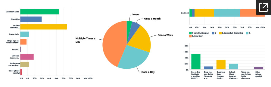
For a project like this, before jumping into design ideas several important statements had to be defined. “Who would use it” “What would they do?” and “Where would they do it?” were all questions that needed to be answered BEFORE we asked “How?” I worked with product managers and other designers to write a comprehensive survey. The goal was to get an idea of what was done in classrooms today, and how accustom the teachers and students were to using technology. We received 133 responses to the teacher survey, and found several enlightening answers. For instance: Nearly 70% of students used an educational app on a daily basis. Also, half of the teachers said that their students had access to their own device (not sharing) — View the full report.
This survey helped lay the groundwork for what we were to build. However, the actual UX of it still had several question marks. Following the survey we conducted one-on-one interviews with a several teachers, to address this.
IDEATION
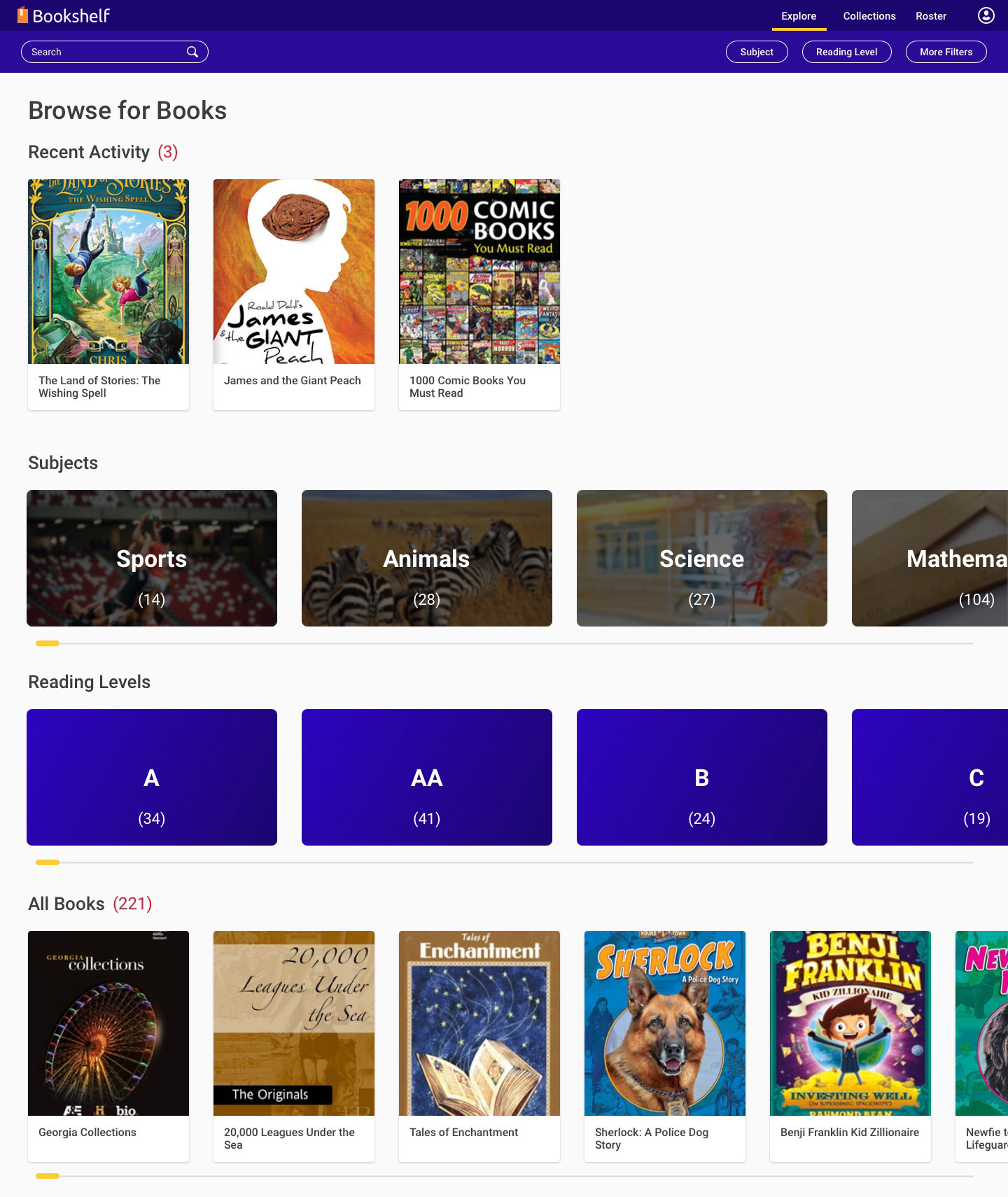
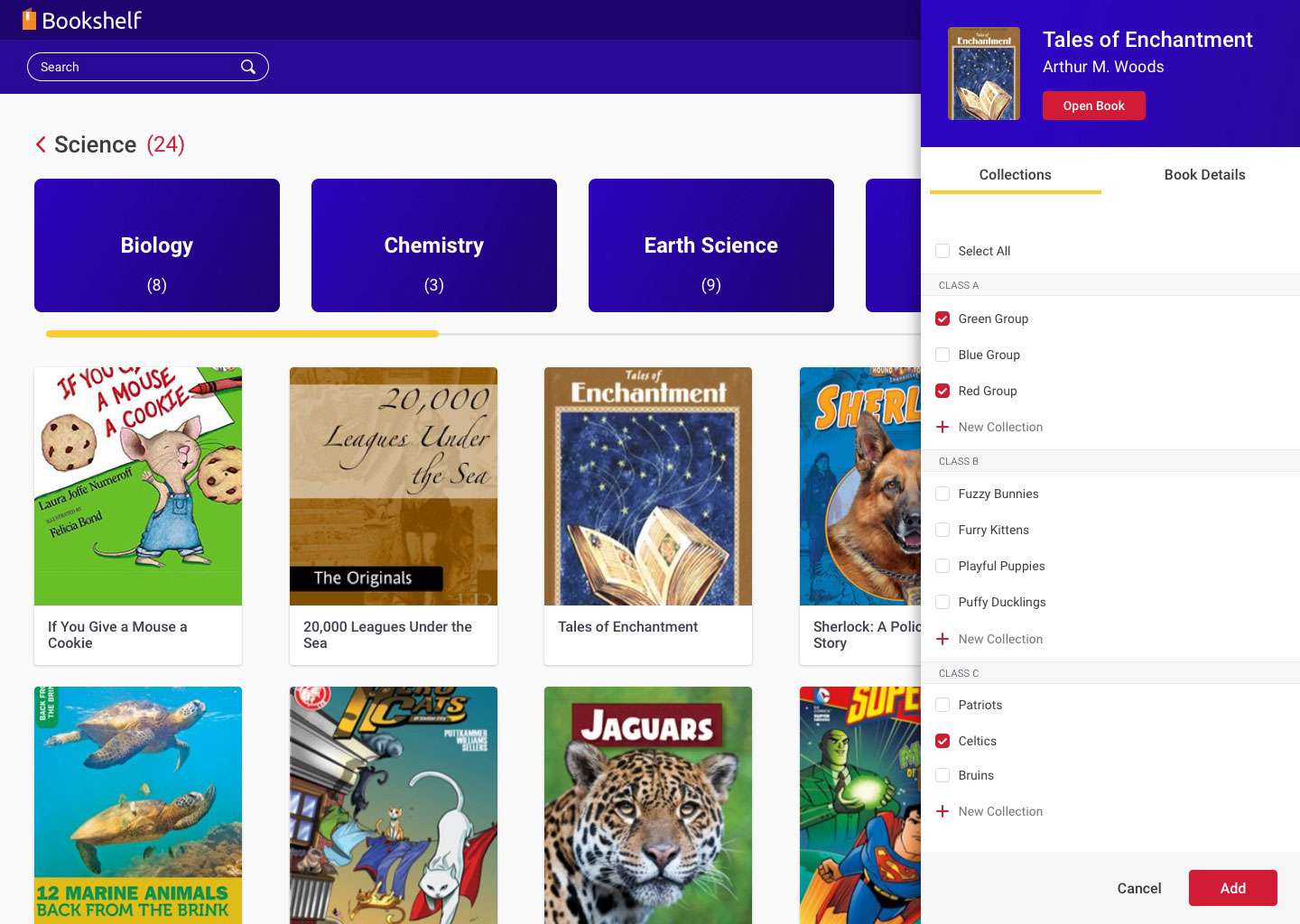
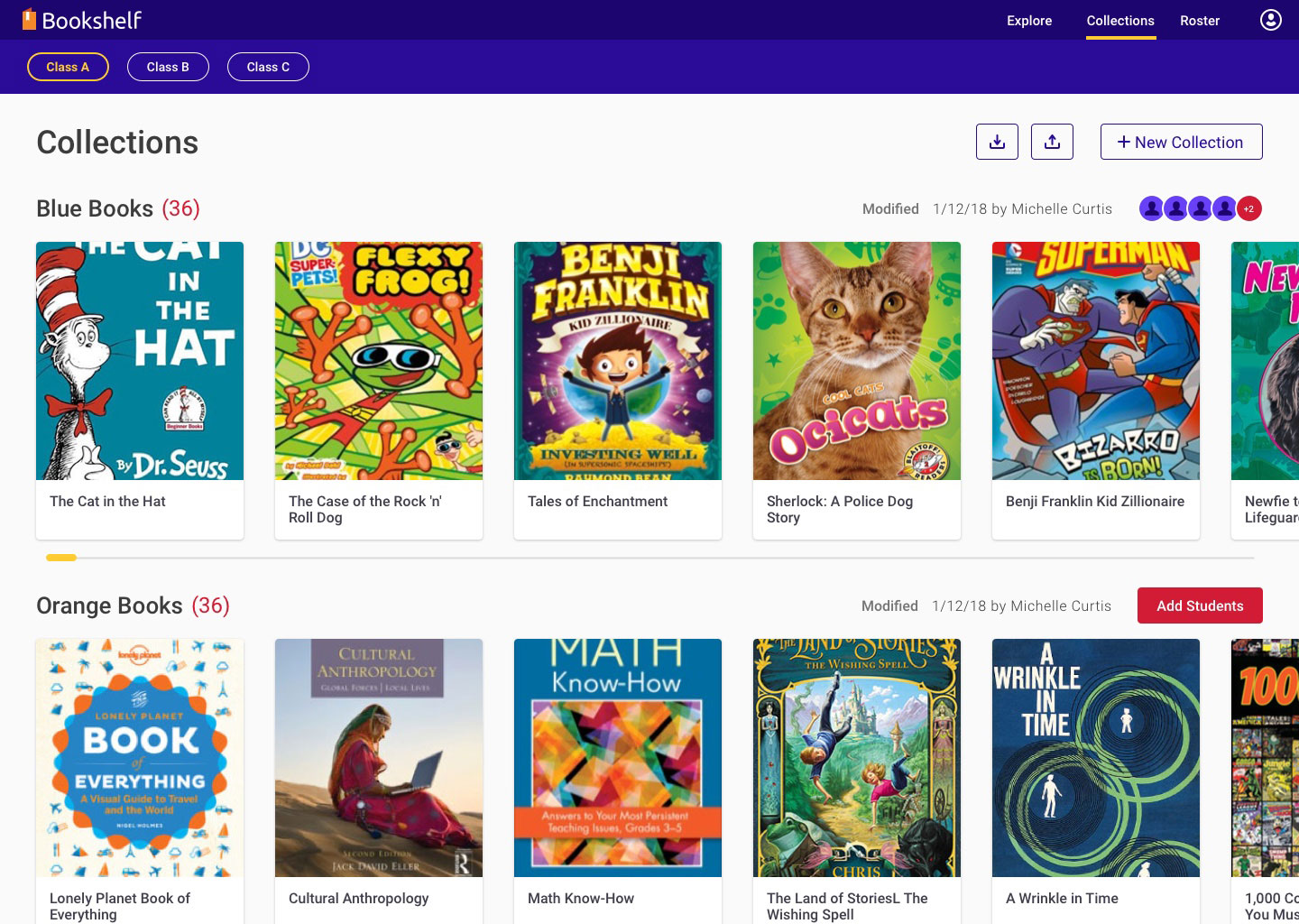
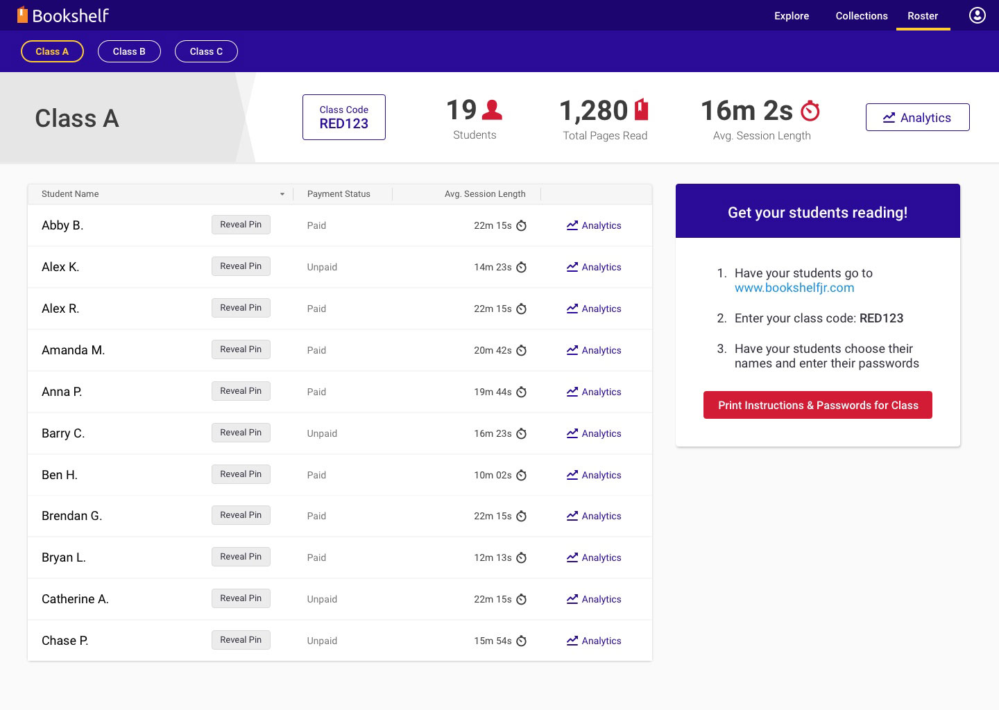
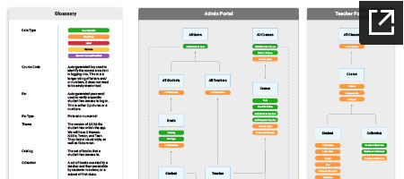
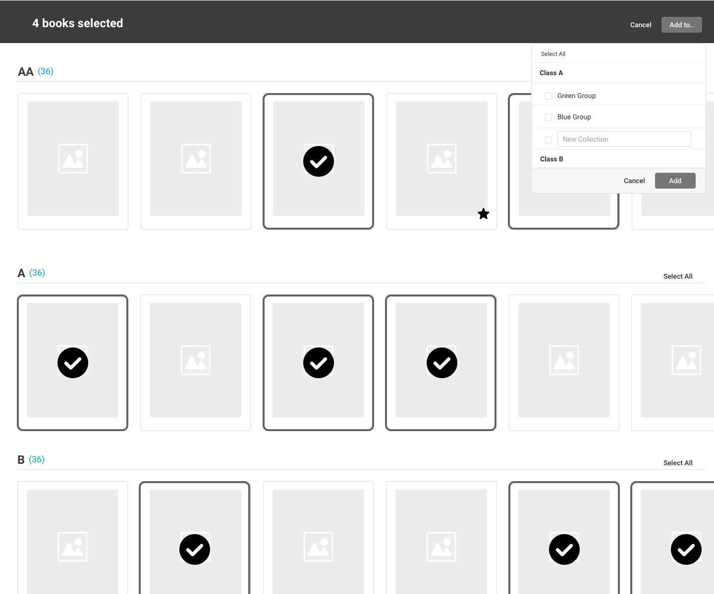
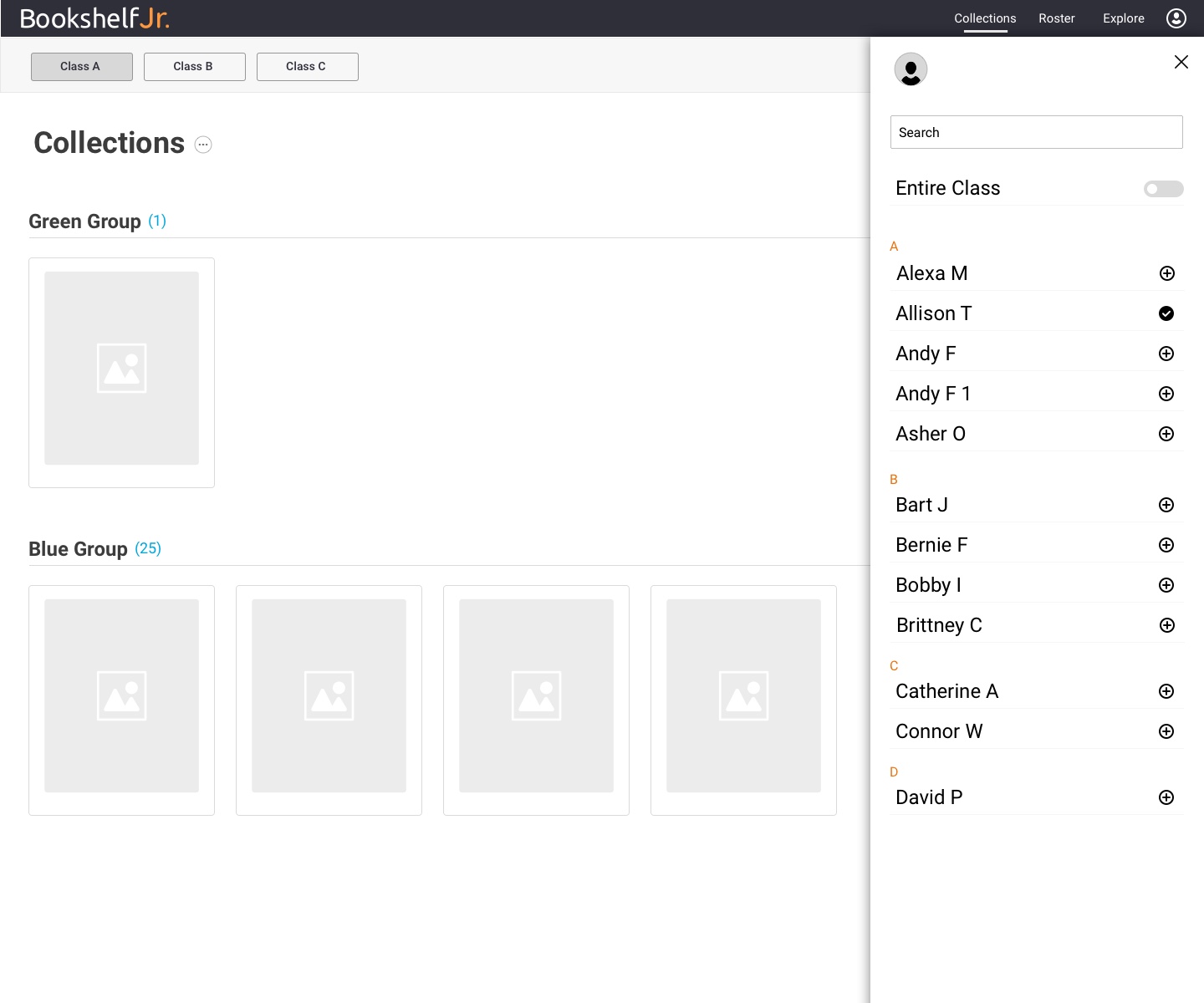
In addition to the teacher portal, there would be an accompanying administrative portal to do things like initially set up a school, user accounts, and various data. I created several IA diagrams to organize and define what would be done, where, and what type of data it was. After the architecture was set, it wasn’t hard to see that there’d be two main purposes of the teacher portal: managing books and managing students. I created several detailed flow charts to visualize the possibilities. After evaluating the ideas, and the complexity of it all, I thought it was best to further separate book management into “exploring” and “collecting” books. The Explore section would be where teachers browsed a large catalog of books, from here they could choose which books they wanted to add to a Collection. Collections are essentially groups of books paired with groups of students. We found that teachers can have many different reading groups. Students move between them, and books are added and removed, frequently. Thus, the Collections section created a space where teachers could focus on what actually was being used in their class.
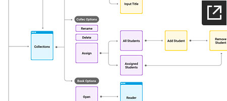
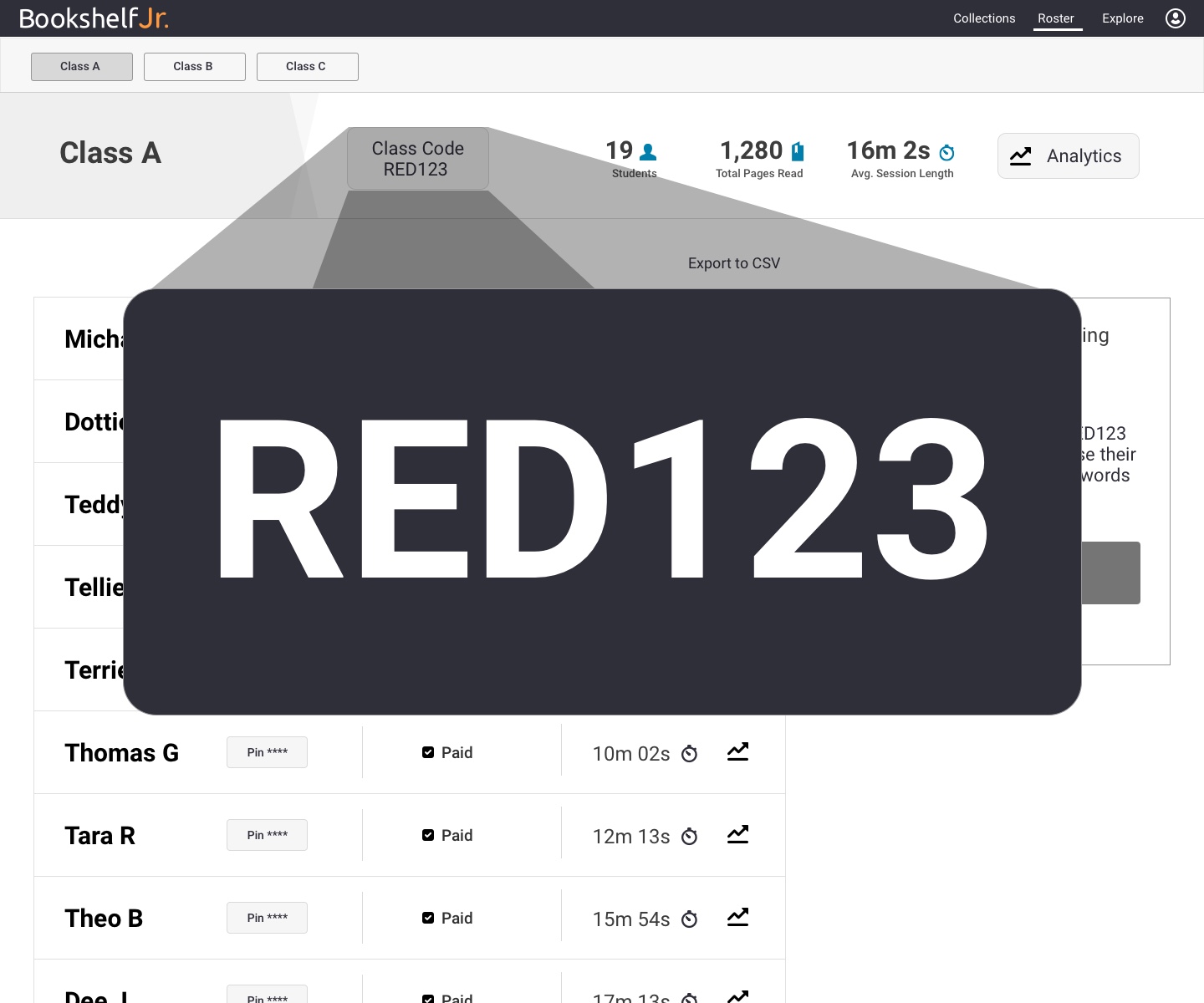
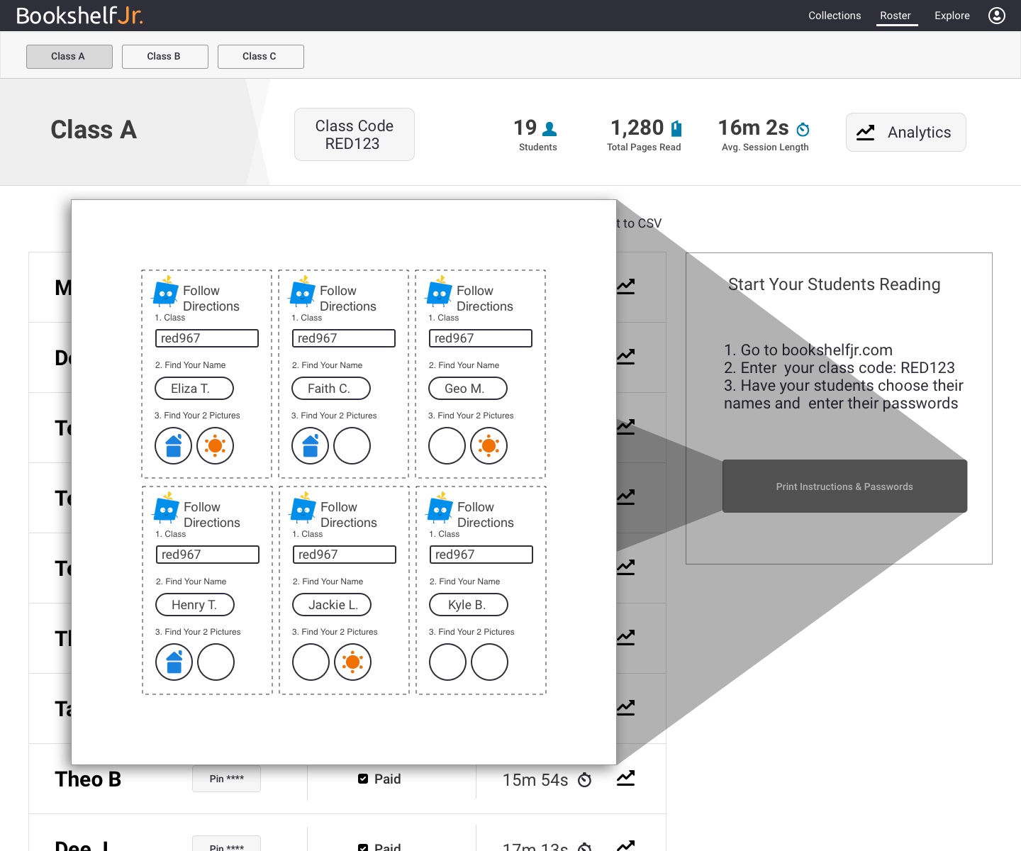
After deciding on the functions of the main screens, some of my favorite other features include: the ability to add multiple books to a collection at once; a toggle to have an entire class assigned to a collection, regardless of if the roster changed; a large screen for the class code, so it could be projected to the classroom; and an easy way for teachers to handout log in information to their students.
FINAL DESIGNS
Before development was complete, two big clients already signed on. From the design prototype they were able to see how this could vastly improve teacher and student outcomes, and wanted to be ahead of the competition. I have no doubt that the detailed design exploration was a big part of the product’s success, as well as keeping close relationships with users throughout the project, and incorporating their input with UX know-how