THE CHALLENGE
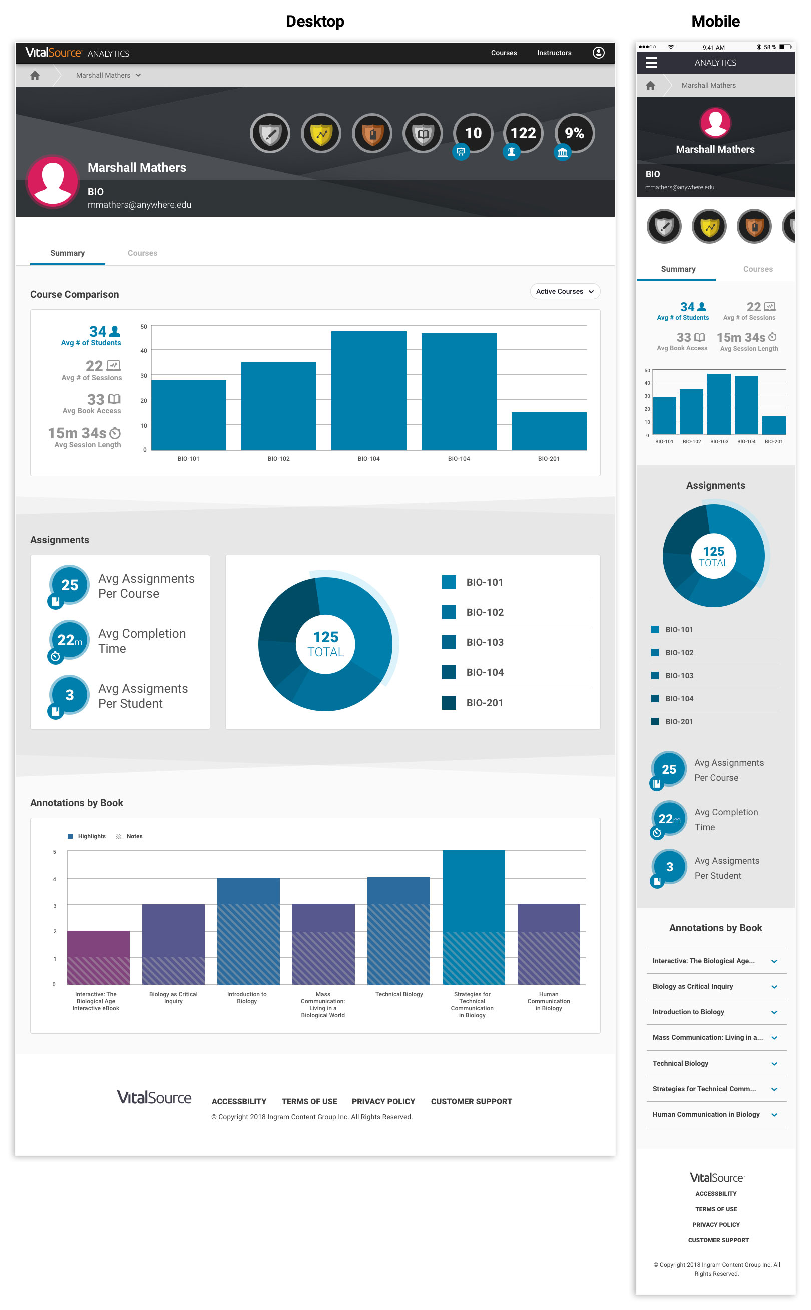
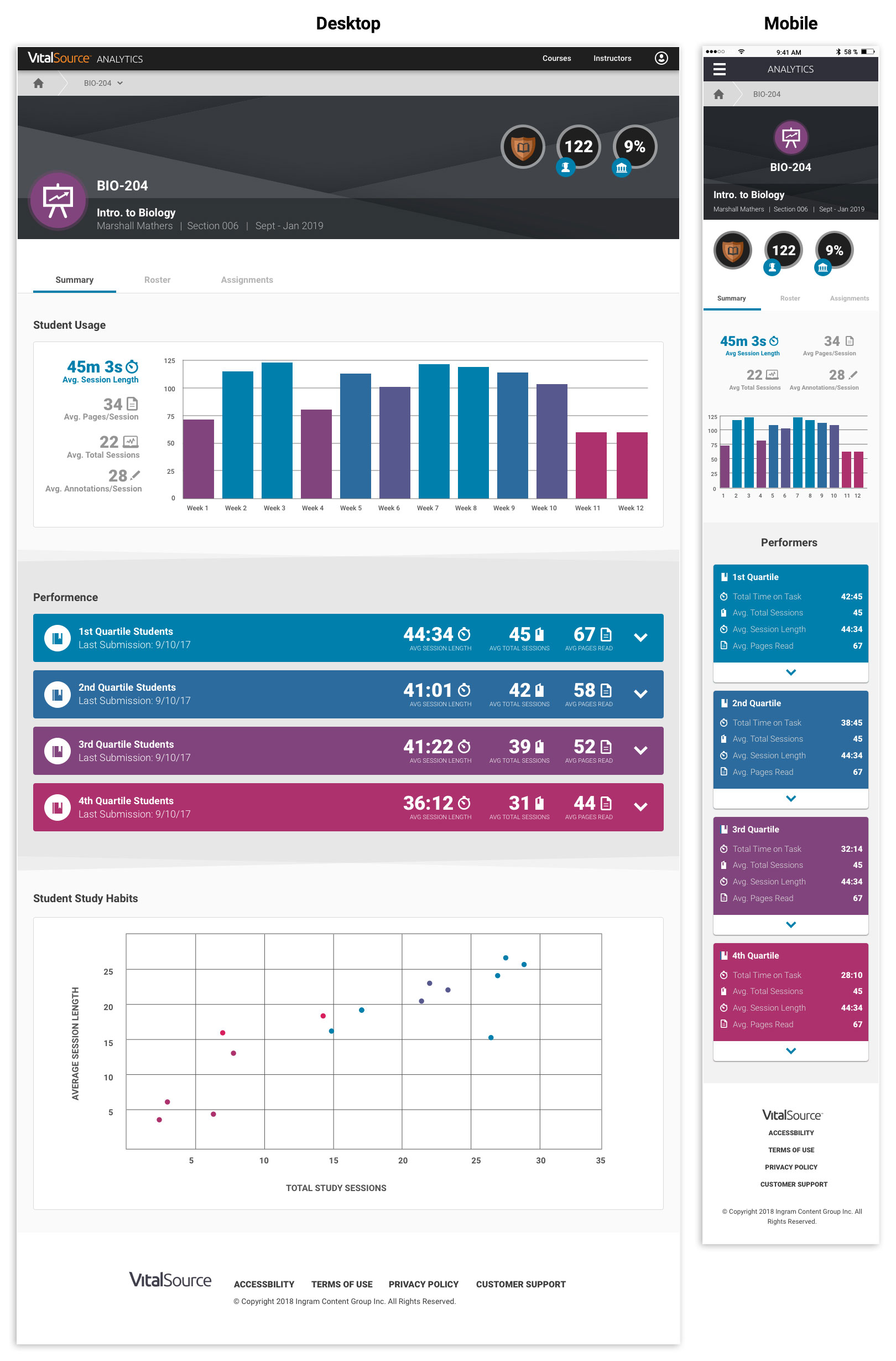
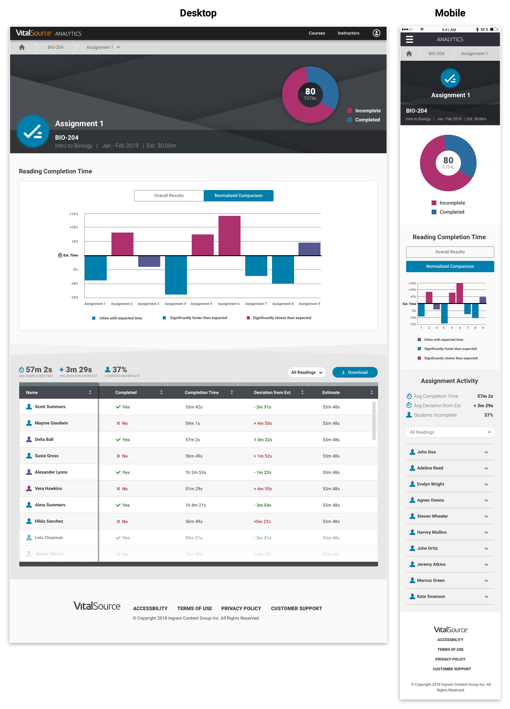
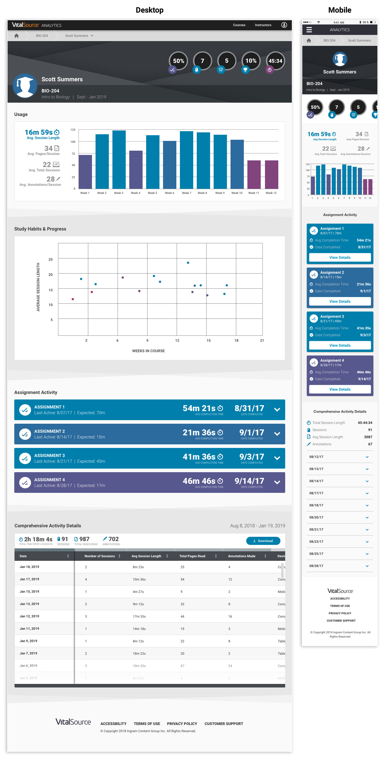
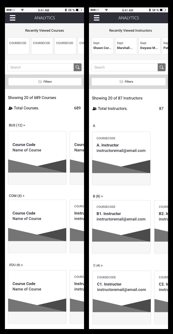
One interesting product I helped create was an extensive analytics platform to help institutions analyze the engagement of their users and course material. Clients previously could access sales and billing information, but were clamoring for more insightful data. Specifically the schools wanted to accomplish three objectives: (1) Allow instructors to see how their students are performing, and identify struggling students. (2) Let deans see how their instructors are engaging with their classes to ensure students are successful. (3) Give business teams the information they need to decide which programs and technology to invest in further. Also, the application would have to be responsive as many instructors use tablets in the classroom, the business teams are often on mobile devices, and so forth.
BRAINSTORMING
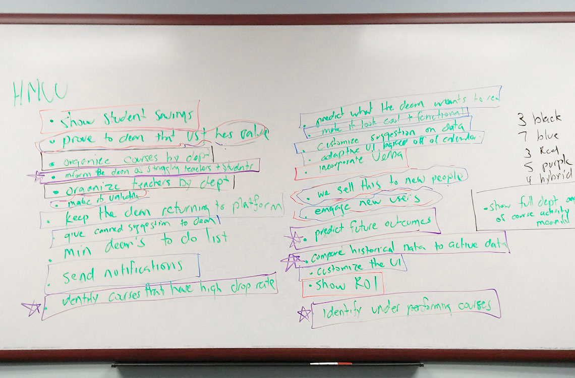
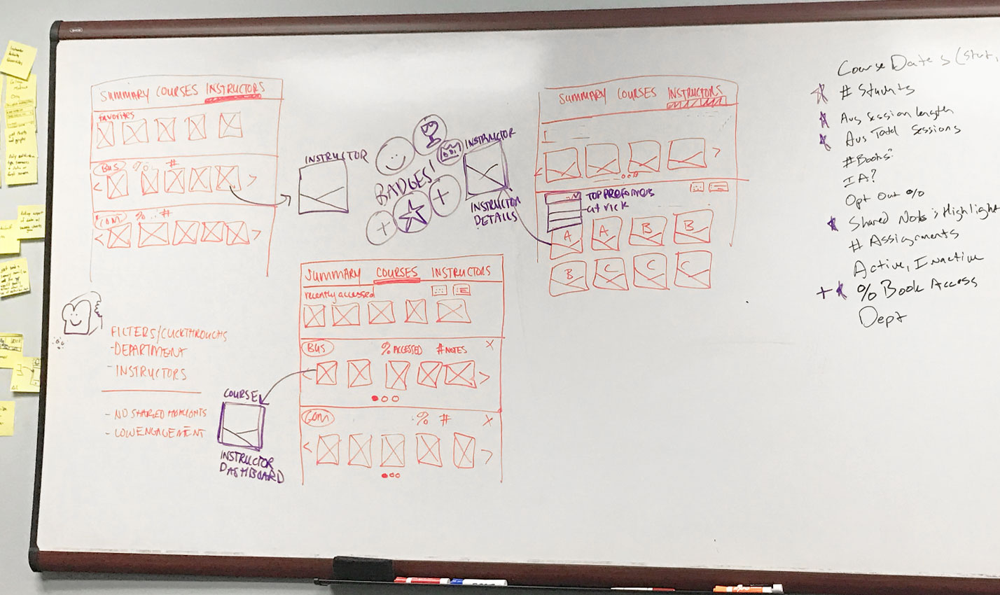
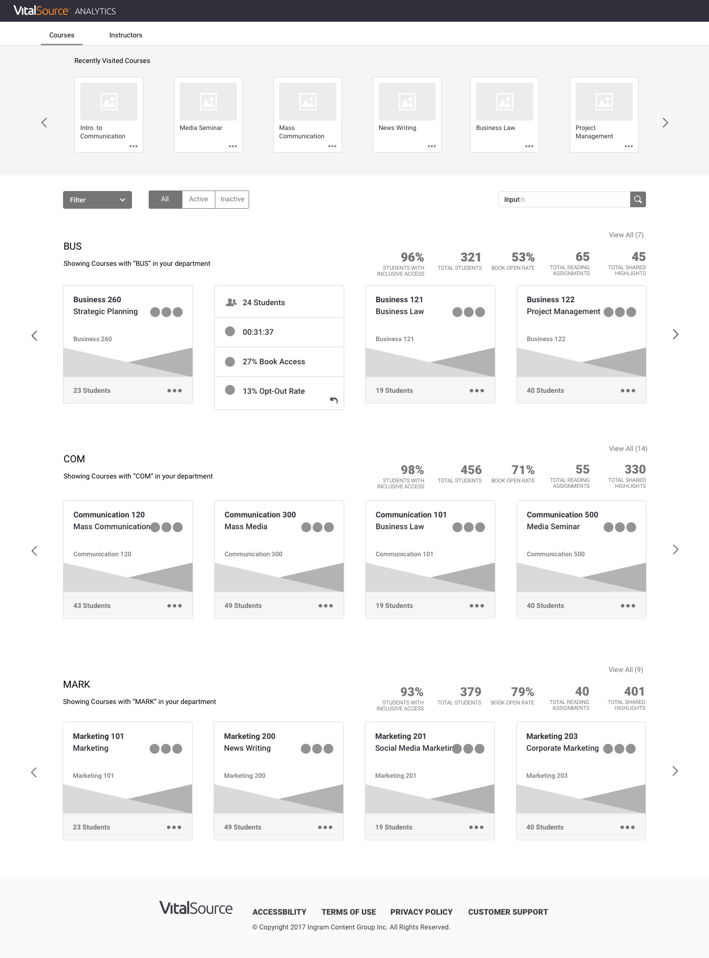
To kick off this project, I was able to organize several days of Design Thinking sessions with design, product, and development teams. After going through several exercises, we confirmed and further elaborated on the three goals mentioned above, and began to scope out the application. We decided to segment the app for the three different users: Instructors could only see their own performance, classes, and students. Deans could see the performance of the instructors they managed, as well as all their instructor’s class and student data. Finally, business analysts could see every instructor, class, and student. Aside from securing sensitive information, a helpful analytics platform should walk users to what they need, and explain it clearly. Once the segmenting was clear we were able to form the structure of the site. There would be two starting pages; All Instructors and All Courses. Then an Instructor or Course Detail page, respectively. From Course Detail pages you could drill into an Assignment or Student Detail page. This aloud us to scope each page to the specific user, and completely remove some pages, without interrupting any user’s experience.
IDEATION
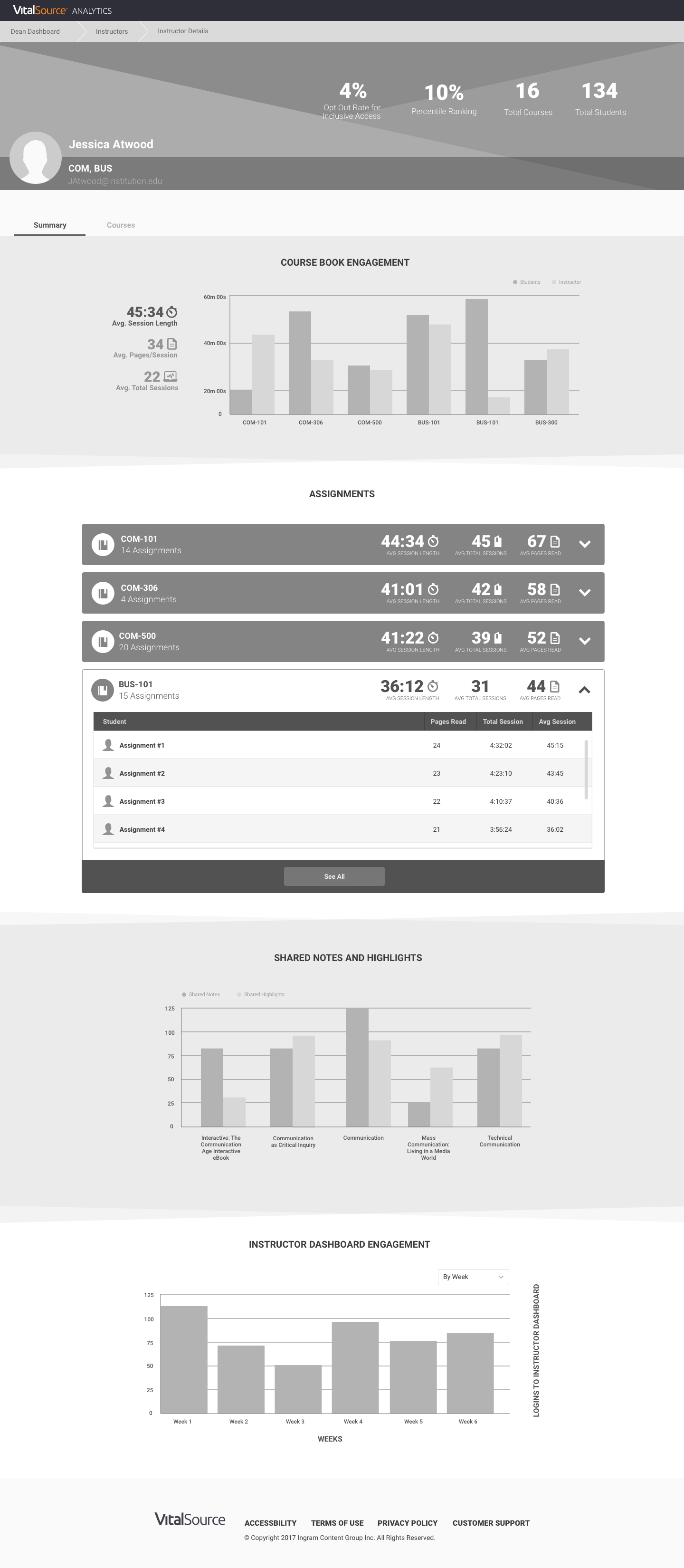
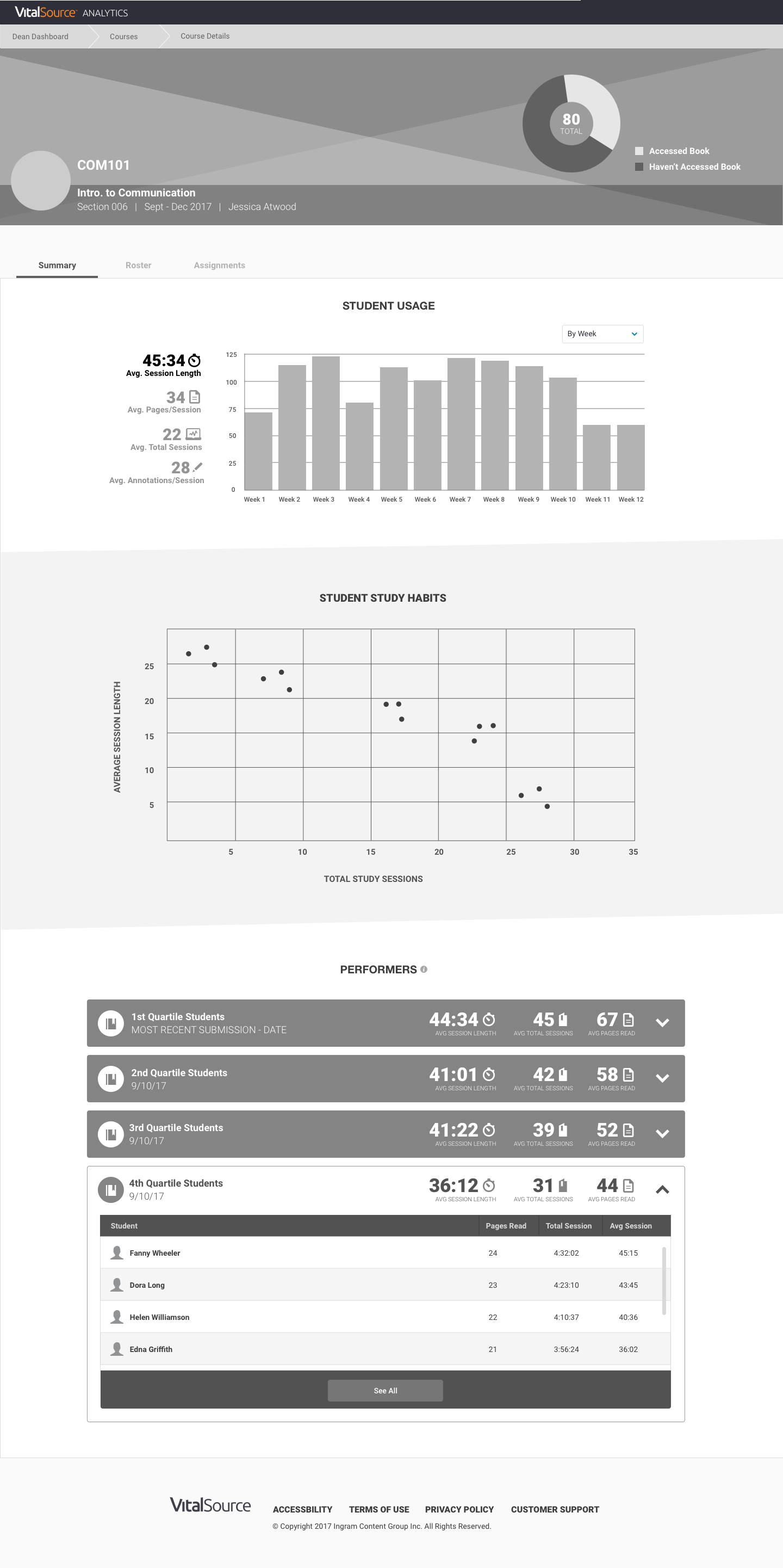
After defining the problem in detail, and sketching out the structure and features of this application, myself and another UX Designer began to create wireframes, and explore the specifics of all the various tools and screens. One idea that I think really made this more interesting and useful than other analytics platforms I’ve seen was the addition of badging. The simple gamification techniques would not only easily summarize complex data, but also encourage teachers to boost their performance. Badges were awarded on a normalized scale: null, bronze, silver, and gold. Not all data points were performance driven, so in addition to the badges we created a similar a UI treatment for important static information, like number of students in a class. During onboarding, deans and admins could define the parameters of each badge. Another key component of the ideation stage was exactly what data points would be displayed, and how. This involved extensive conversations to make sure the information we presented was both useful and drew accurate conclusions.You’ll notice that we make use of everything from bar graphs and pie charts, to tables bubble graphs. These were all chosen specifically based on what the data was, and what conclusions it could draw.
DESIGN SYSTEM
A design system is a series of building blocks, some small and some large, but they all fit together to construct an application. Working with the other designers on my team, we began to organize the structure of our system. We studied Atomic Design Methodology, and started to modify it to fit our needs. I eventually came across this article on GE’s Predix Design System that was also helpful. Taking all methods into consideration, I settled on four levels that worked best for us: Principals > Basics > Components > Templates. After much work organizing, designing, and documenting, we created an extensive system that will no doubt grow for years to come. The below is a sample of the outcome (I’m not at liberty to post the entire final version).
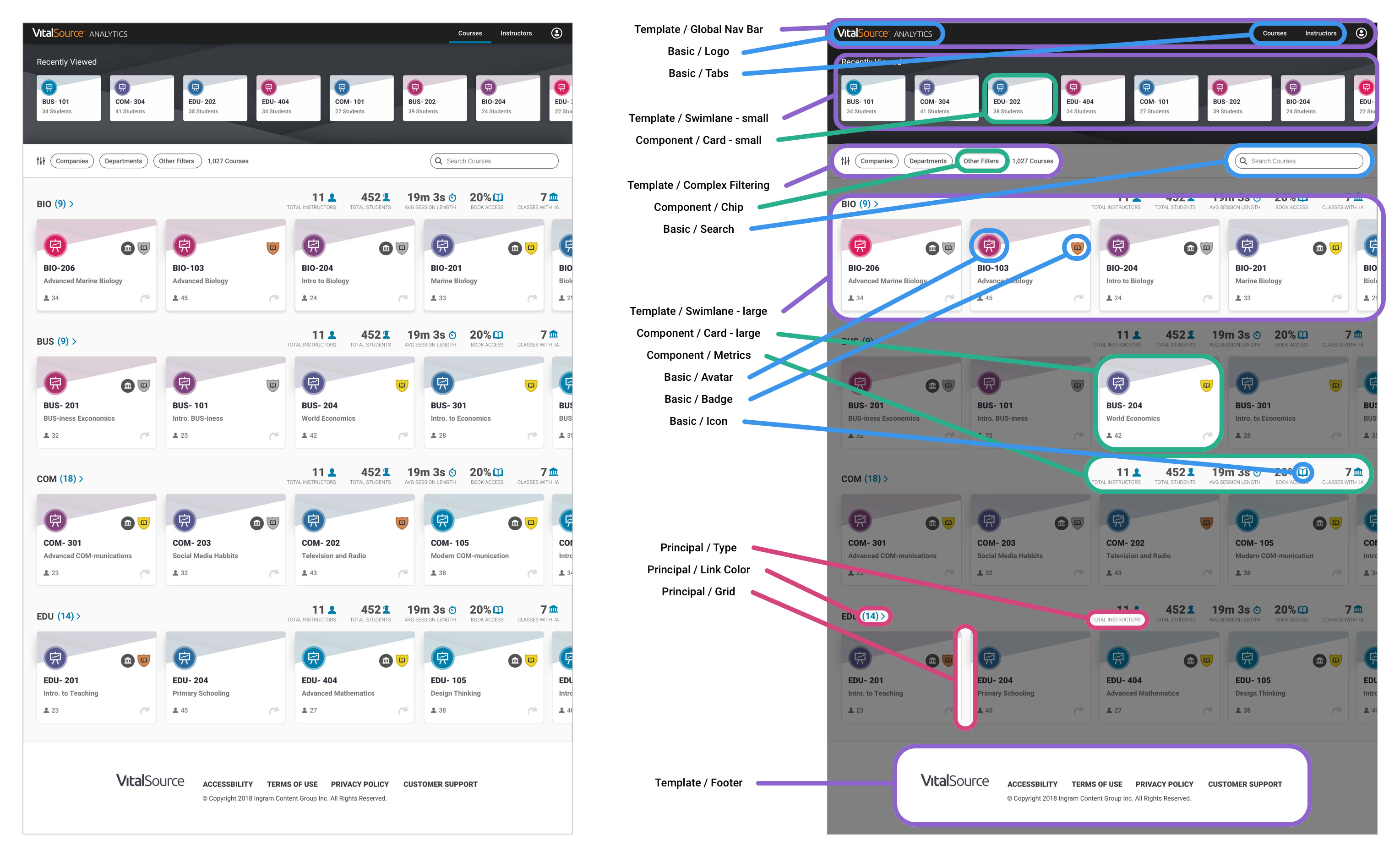
In the following image you can see how all the parts work together to construct a complete design.
FINAL DESIGNS
As instructors would see a subset of the app, those screens were built and released first. Once instructors were able to start using the app, we instantly heard from deans and other users wanting their features. Largely because of the design system, we were able to quickly and efficiently release a second version of the app for our remaining user types. The design system also provided another unplanned, yet delightful benefit, other VitalSource products began to use the system to embed and integrate analytics within them. In Bookshelf soon students will see how much time they spend studying and how it relates to their performance, in Financial Reports users are getting advanced tables and graphs, and I’m sure more is to come. The system will continue to grow and evolve with our products, and no matter where the components are used, they will get updates seamlessly.