THE CHALLENGE
eBay revolutionized the collectibles industry in the late 90s, making rare items available to anyone anywhere. Recently, I noticed sellers growing weary of increasing fees and looking for alternatives. Social media sites served as shoehorn solutions, connecting buyers with sellers while eliminating the middle man (and fees). An interesting format started developing, raffling. Potential buyers were purchasing the chance to win an item by only spending a fraction of its full value. Although popular, it’s easy to see the problem — how could you ensure drawings were fair? I’m passionate about creating a decentralized web, and this app fits perfectly on the blockchain! Creating a decentralized application (dApp) would not only secure and verify monetary transactions, but also ensure drawings were fair, players were real, and distribution was automatic. To further create a positive community, I added a charitable aspect. Sellers could choose a charity to donate a portion of their proceeds to. I partnered with an engineer and thus began dRaffles.
RESEARCH
To better understand the business goals, potential users, and problems to solve I took several approaches, but evaluating competitor approaches and surveying existing buyers and sellers provided the most insights. I reached out to the hundreds of users I saw transacting on instagram and in facebook groups, and offered special access to our beta release for filling out the survey on our website. Here are the full Competitive Analysis and User Survey reports
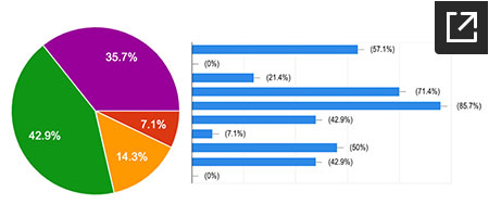
Below are the main takeaways
- Creating a raffle needs to be quick and easy
- No seller fees, split fees amongst buyers
- Mobile and tablet are most important
- Low barrier to enter a raffle (no checkout, instead preexisting bank of funds?)
- Facebook and eBay are most used for selling
- Amazon and Etsy are most used for buying (but FB is more preferred)
- Users want to know something is secure without “dealing” with it
- Transparency in transactions and drawings
- Focus on p2p, we connect users, we’re not involved in everything
- Hosts can build a brand/reputation
- Transacting in cryptocurrency is less important, might address this after MVP
- Needs a large audience to be successful
- If we can attract sellers, buyers will follow
- Buyers say security is most important, but don’t act like it
IDEATION
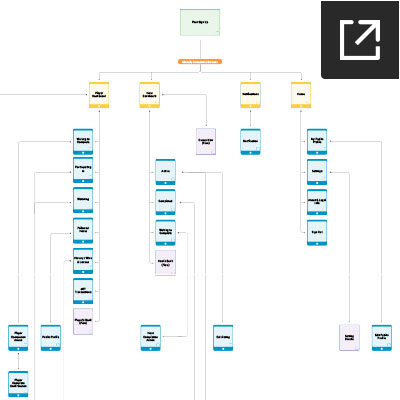
As with most peer-to-peer marketplaces, virtually all users are buyers, but only a small subset are sellers. From a UX perspective this creates a bit of a catch 22: If you focus on the needs of the majority you may discourage selling, and thus the platform is dead. Because of this I wanted to create two separate but equal spaces for buyers (players) and sellers (hosts). The user flow below shows how this is architected, along with many other screens and options.
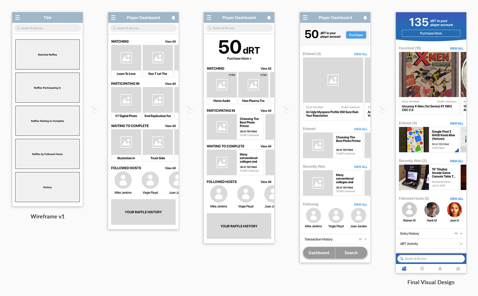
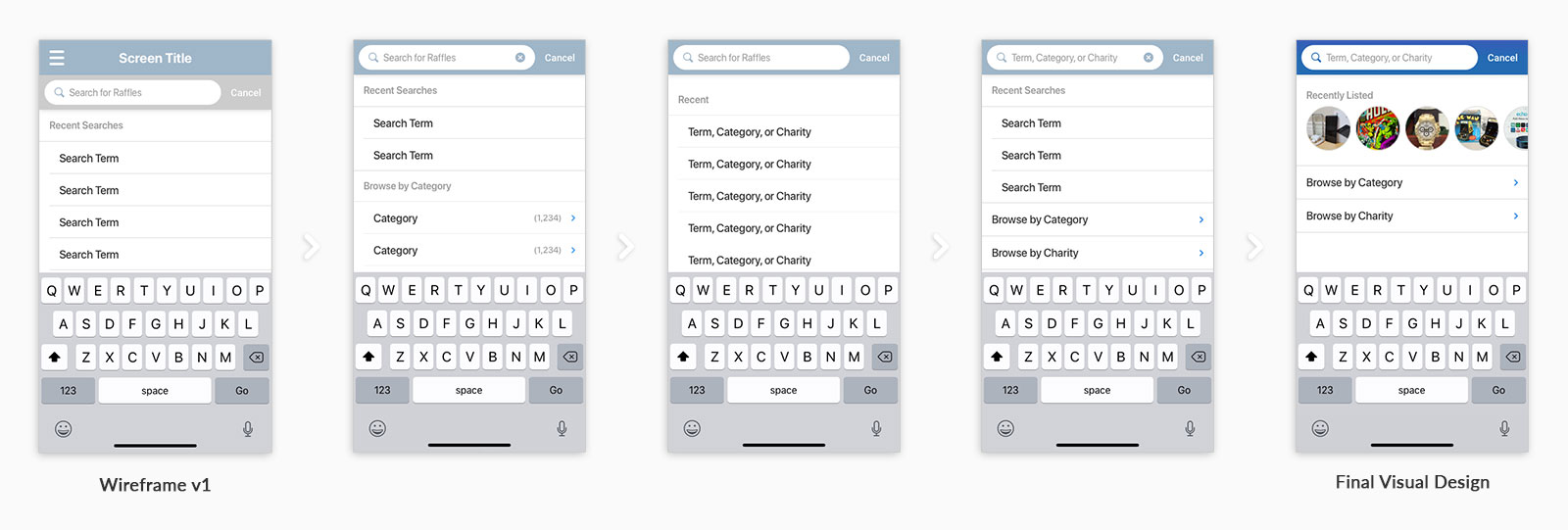
After settling on the architecture (somewhat, of course it changed along the way), I started sketching and wireframing. The above examples provide a good snapshot of this iterative process.
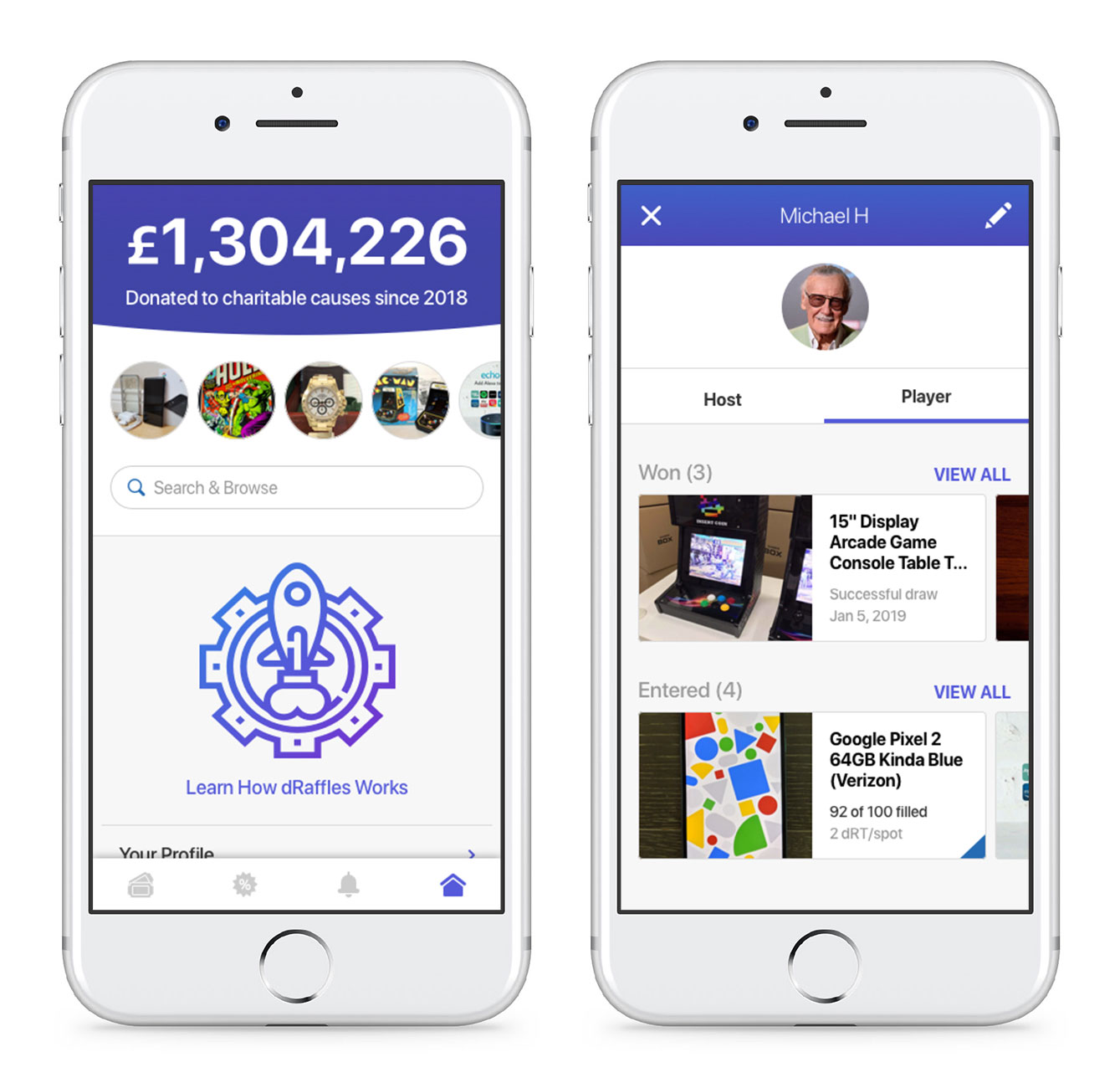
Player Dashboard — The first version has the necessities, but was missing a key element: how many tokens a player had, and how they could buy more. Along with that, I played with how search could work (more on that in a minute). Another key factor was how lists of raffles would be displayed. Even in the wireframe stage I started defining a design system. On this screen I explored the way lists/groups of raffles would be used throughout the app.
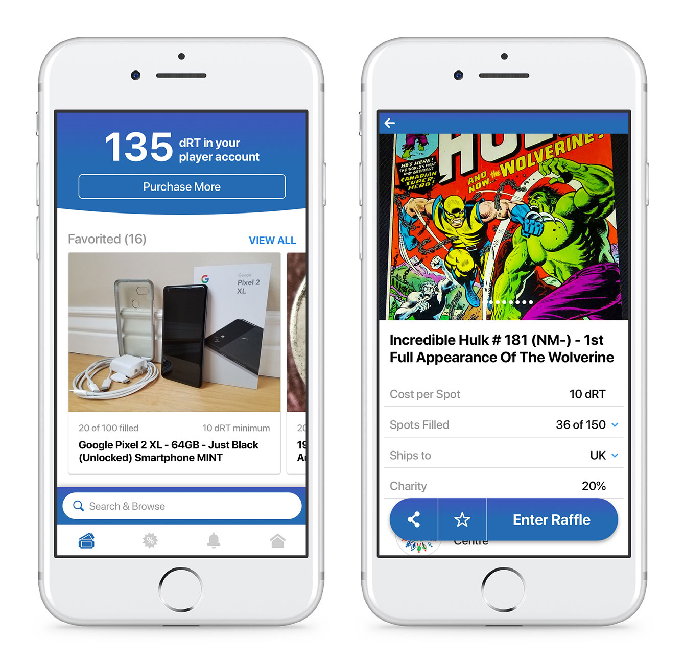
Search & Browse — I realized that many eCommerce sites have the ability to browse by subject, but for shops with a wide variety of products (amazon, eBay) it’s largely unused. In order to save real estate on other screens, I found a way to incorporate browse by category, or by charity, along with search in an overlay. Similarly, I opted for “recently listed” items instead of “recent searches.” Especially in the beginning this would help users find what was available on dRaffles.
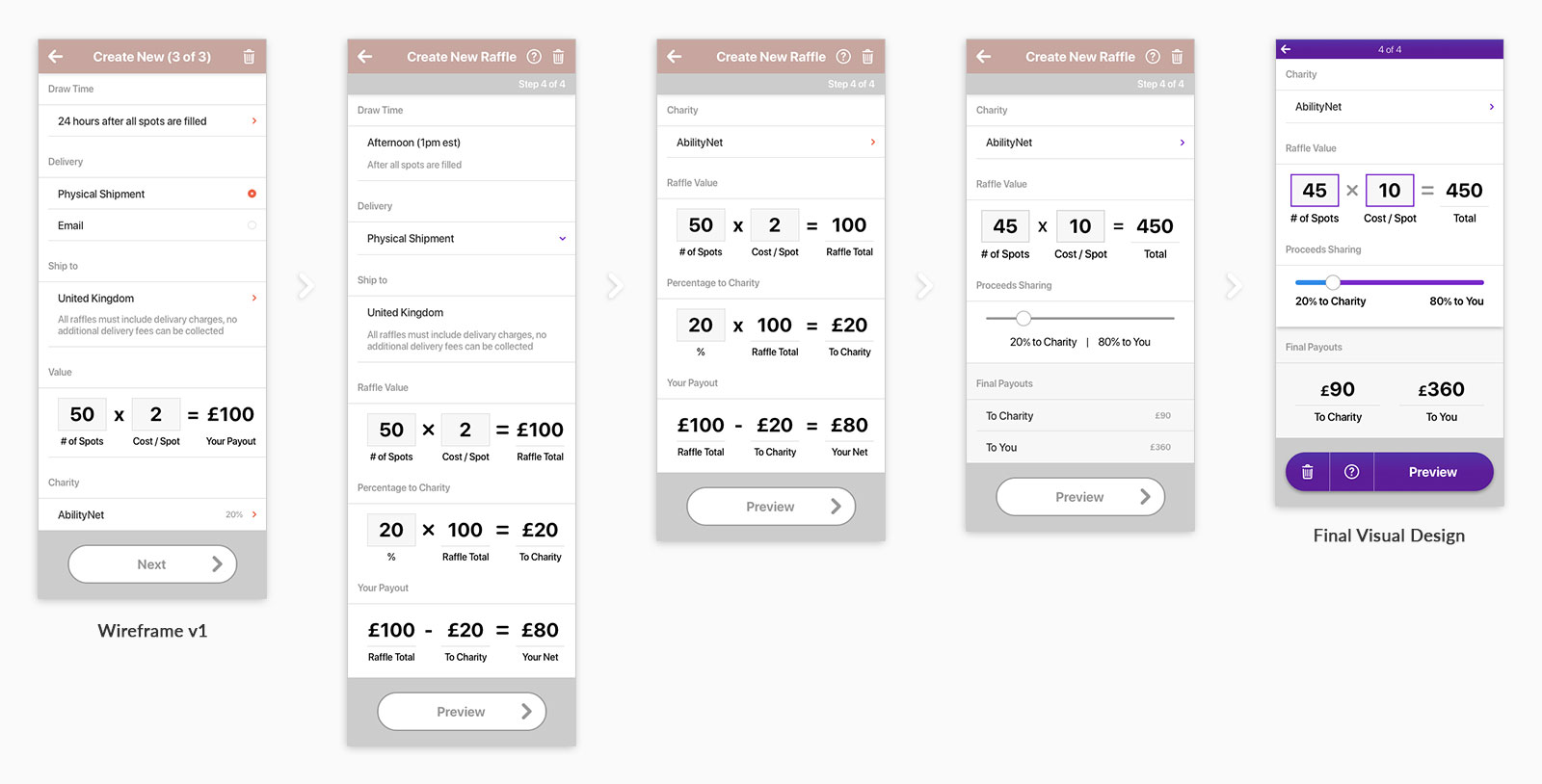
New Listing Values — The ability to create raffle quickly and easily was paramount. I wanted a step-by-step process that had no more than 5 steps (eBay has upwards of 10). The struggle of balancing that number with the amount of content on a screen can be seen on the “Details & Value” step. Ultimately I put “Details” as it’s own step, and used a few creative UI elements to simplify screen and clarify the information. Also, check out the prototype to see how the content appears progressively to guide the user.
VISUAL DESIGN
Aside from aesthetics, visual design also double checks UX decisions, and like wireframing it goes through a progression. Color was a major part of the visual design. Aside from just the aesthetics, it grounded the app and defined various spaces. Below are samples of the coloring process, and examples showing the evolution the UI went through.
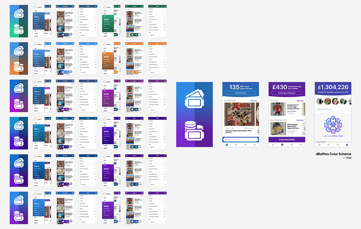
Color Theory — As the “host” and “player” areas were geared toward different actions and users, I wanted to have two different colors to further define the spaces. I stepped out a lot of different versions (this image is merely a subset). I found that using analogous colors aloud me to also have a middle tone to use in neutral areas, where complimentary colors had uglier middle tones. Analogous colors also produce a more pleasing gradient that I used throughout the UI.
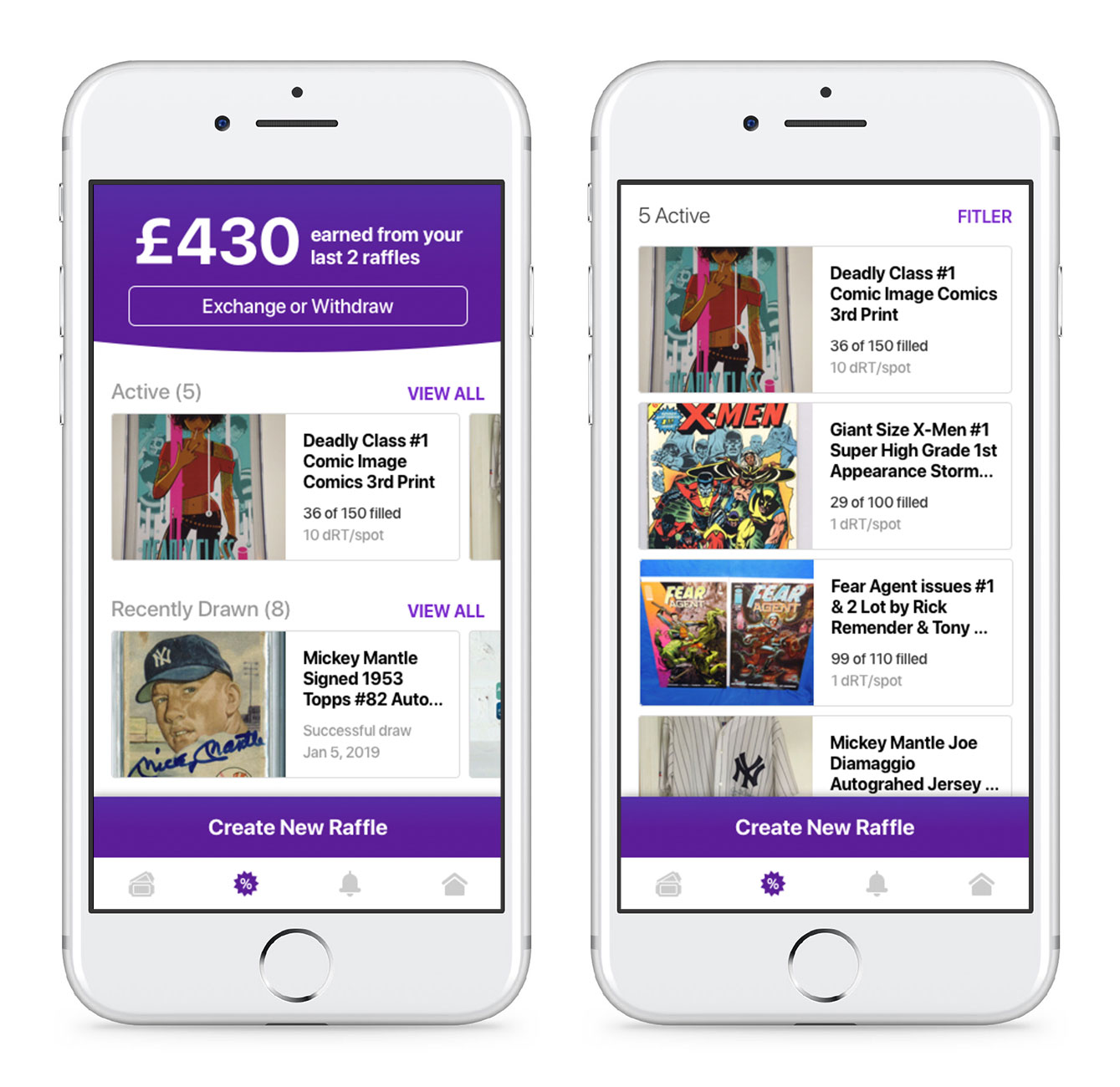
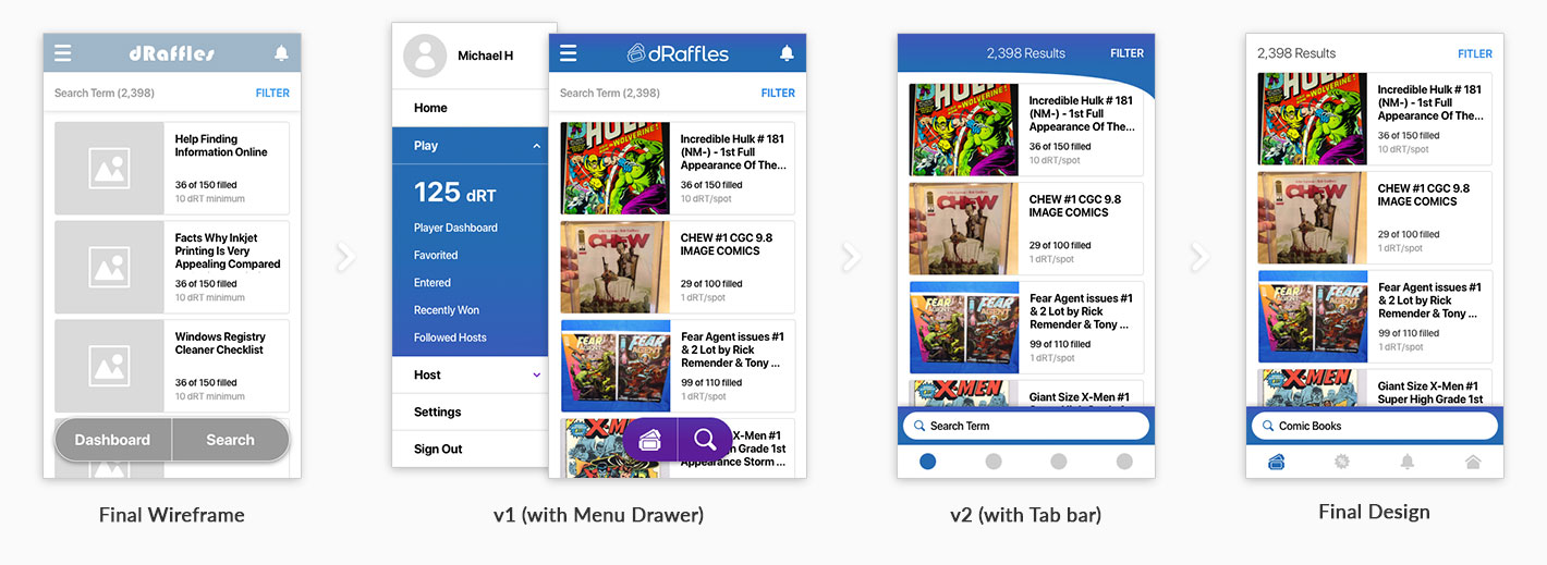
Search Results — One idea the visual design influenced back to the UX was the use of a bottom tab bar. The wireframes used a header and main menu drawer for the primary navigation. This looked slightly out of style, and required the user to constantly access the top left of the screen (furthest from one’s thumb when holding a phone). I think the tab bar is a cleaner look, as you can see in the search results screen.
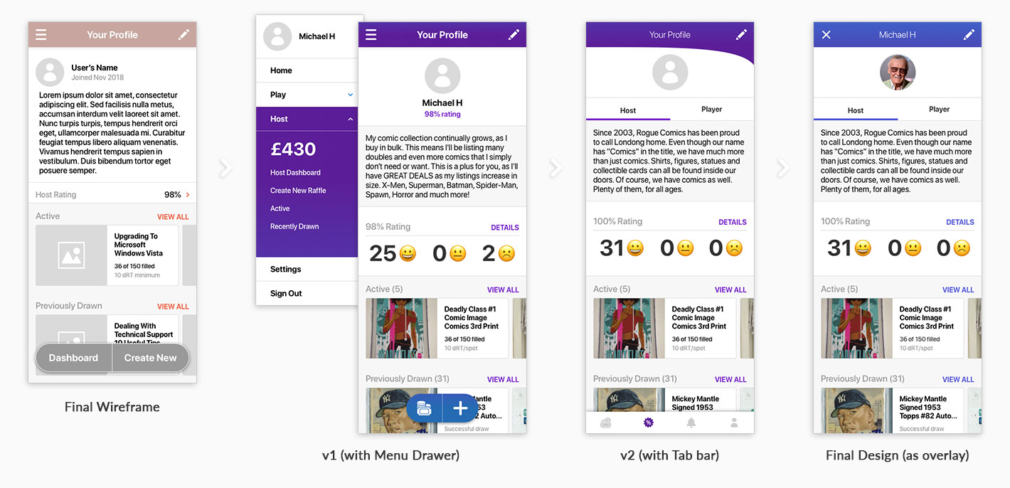
User Profile — There were always neutral areas in the app (not “host” or “player” specific), but the decision to use a tab bar integrated them more. This screen shows that, as well as provides a good example of the color and light gradient choices.
FINAL DESIGNS
Despite great feedback from potential users and investors, ultimately business hurdles prevented dRaffles from getting to market. I learned a lot through starting this company, and the differences between building a successful business and building a successful product have never been more clear. If you’d like to discuss further, connect with me!