THE CHALLENGE
VitalSource’s premiere product, Bookshelf, was created to help users review and retain information. This focus on study tools is what sets the app apart from other eReaders. The mobile apps were built several years before I came onboard, and were due for a significant update. Another precipitant to this redesign was the addition of “classroom” features. Through new APIs, the apps could not only see a vast library of books, but know the specific books each student used in their classes, as well as teacher assigned reading within those books.
PREVIOUS IMPLEMENTATION
The previous version of the mobile apps basically took the desktop site and “mobilized it.” I believe most products deserve a fresh look when translating to new media. It’s important to create the best experience for each environment, consistency across platforms is a strong consideration to weigh, but not the only one. Another downfall of these designs is that almost no native elements were used; everything from menus to transitions were a custom build. This made updates taxing on engineering, as well as an unfamiliar experience for end users.
RESEARCH
As I sorted through feedback, reviews, and analytics it was clear there were many features that needed improvements, below are some of my findings. For the new classroom features, I spoke with several teachers and school admins to determine exactly how textbooks were used in classrooms today. I found they are generally used in three ways: (1) Teachers would use just one book throughout a semester (2) One core book was assigned, but a portion of other supplemental books were also used (3) With better and cheaper access to digital material, teacher were finding it beneficial to jump between several books, a chapter from one, a few pages from another, etc.
FINDINGS
- Users unable to recognize the purpose of “skip” navigation
- Low usage on “home” and “current book” buttons
- Inconsistent navigation between Bookshelf online
- Use of non-traditional IOS/Andriod app behavior
- Items on toolbar are not prioritized by importance
- Unfamiliar navigation icons
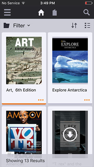
- TOC opened most frequently followed by Notebook then Figures
TAKEAWAYS
- Easier navigation between all major features
- Add labels to features for clarification
- To ease dev, we should try and use and modify native components, rather than building from scratch
- Thoughtfully have animations that help and direct users
- Many apps have specific styles for mobile and tablet devices, and we should too. Spotify is a good example of this
- Tablet will need to react with “Multitasking” and have defined rules for break points
IDEATION
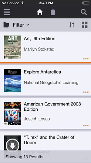
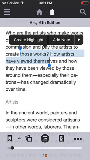
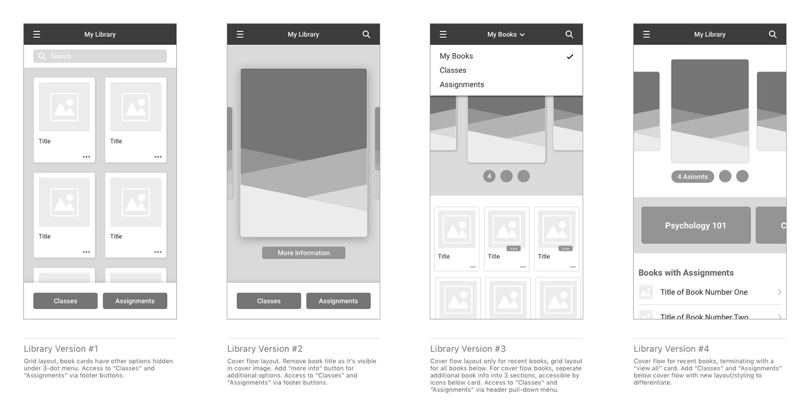
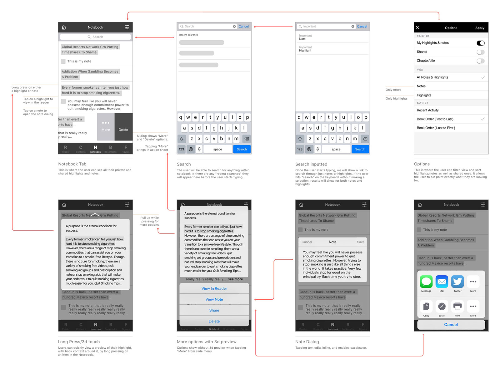
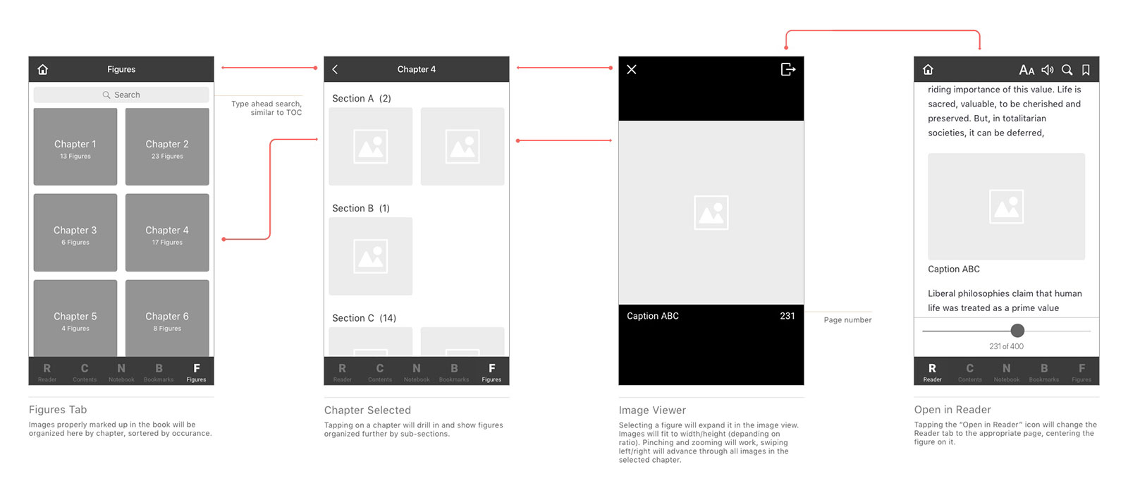
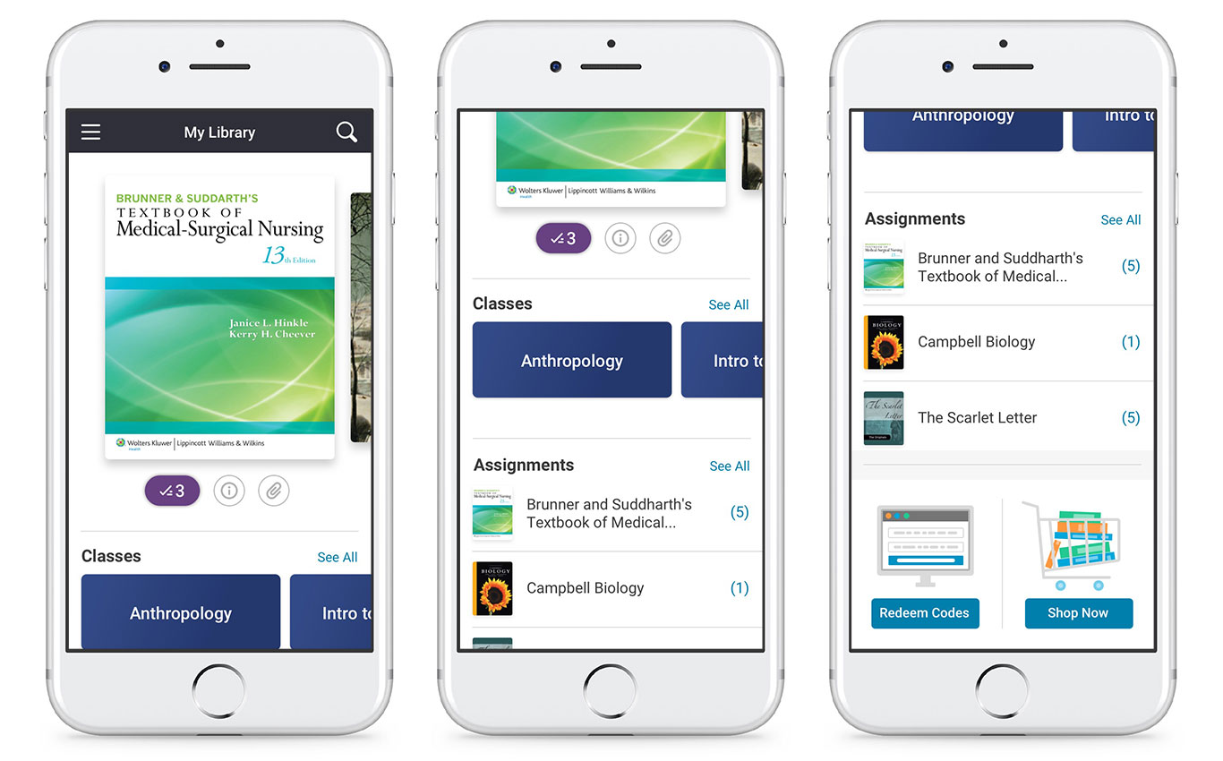
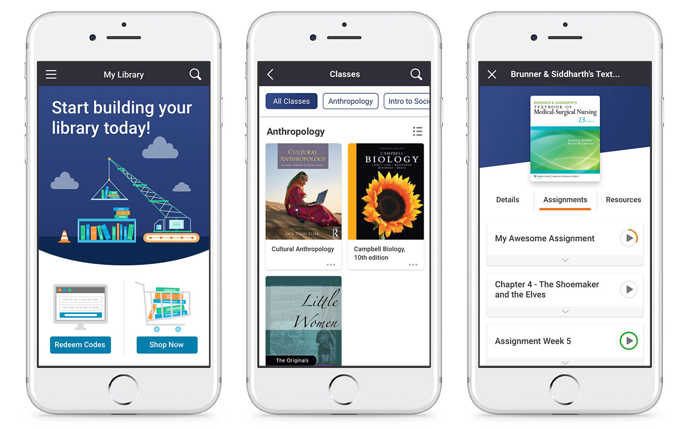
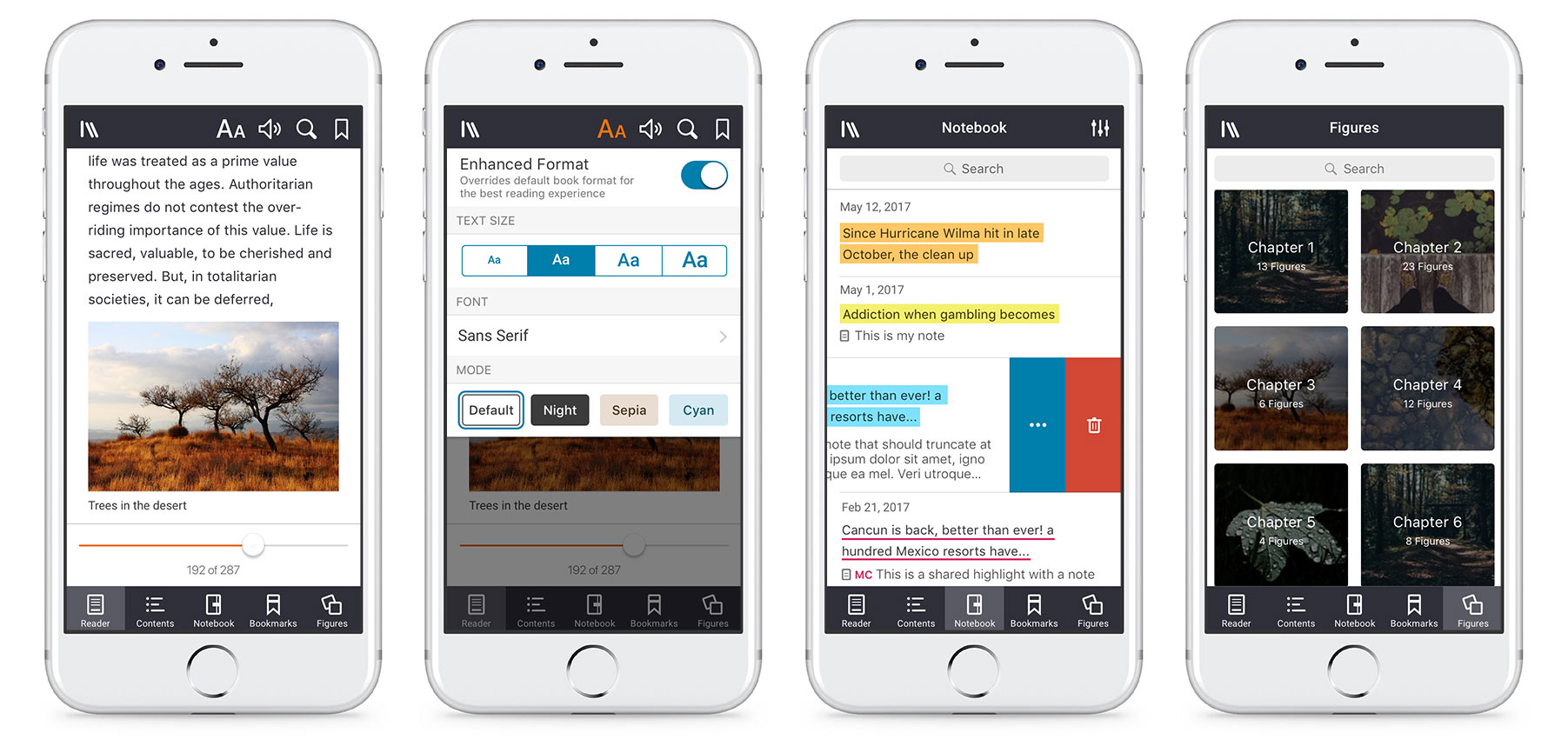
After researching and brainstorming the team created several designs that addressed many of the issues the previous design suffered from. In the first image below you can see a few ideas for navigating between the users main library, class books, and reading assignments. Because of the hierarchy (reading assignments are in a book, class books are in the users overall library) we opted to go for a more integrated screen rather than a UI switch. Although many students have access to plenty of books, we found they were only using a few at a given time, the cover flow at the top of the library played to this nicely. Also below is UX documentation for the Notebook, making use of new iOS interactions, and the Figures panel.
VISUAL DESIGN
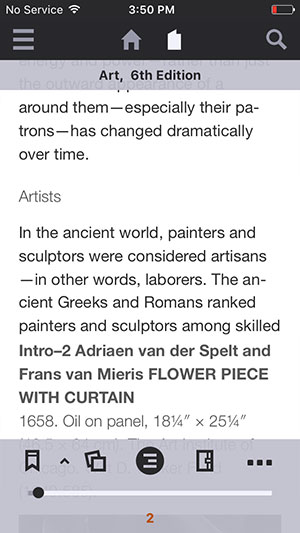
The visuals of the previous app seemed to be lacking imagination. As it was created before I joined, I can only imagine the U.I. did not get the dedication it deserved. Introducing more excitement into the design was very important to me. Our users are students, and this is a learning app, so we shouldn’t go over the top and be too intrusive. However, finding the right places to add style and interactions was more than achievable. We chose a strong blue as the primary color, and a bright orange as the accent. We not only introduced vibrant color, but used angles and curves to further accentuate it. I was also very proud to introduce a graphic style that flowed throughout the app, A great example of this is the “null library” screen. Aside from the graphics, we also utilized a books photos and images where appropriate, as shown in the Figures panel. Final, simple, subtle, and smooth animations were added to appropriate places.
CONCLUSION
This update is being developed in two stages. (1) Implement all the reader updates as well as some visuals in the library. (2) Implement the remaining library updates; the classroom features and new home screen. Thus far stage one has been released to our users. We’ve gotten a lot of great feedback, and I was ecstatic to see a full point (20%) increase in both our Google Play and Apple App Store ratings compared to the previous version.