THE CHALLENGE
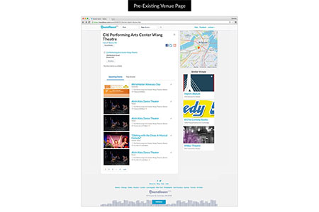
A small start-up, Roundtown had been live for about a year when I came onboard, and unfortunately it suffered from a lack of thoughtful design and identity. Roundtown’s goal is to help people find events to attend; a visually appealing and easy to use site was a must. Roundtown.com is composed of several million pages, but it really breaks down into just a few templates: Search, Event, Venue, Performer, and Company pages. The current site was not only suffering from a bland palette, but users were not signing up, and they were having trouble finding what they were looking for. Because of this, many users saw only one or two pages and then left the site. It was too difficult to “learn” how to use the site, so they didn’t stick around to explore the great content available. After several discussions we decided rather than iterating small changes, a site-wide redesign was in order.
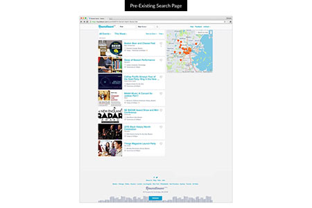
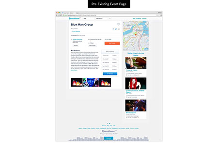
PREVIOUS IMPLEMENTATION
RESEARCH
When undergoing such a large project it’s very important to clearly understand the problem. To do this we set up and analyzed many user and A/B tests. The user testing is very helpful in defining user behavior, what people are expecting, and generating ideas that could help them. The A/B tests help find more specific solution, something that users may often have trouble verbalizing.
SEARCH PAGE ISSUES
- Expected that moving the map would narrow results to that area
- Doesn’t know what the “search on map” check box does
- Forgot that filters were previously set/active
- Doesn’t understand how search results are ordered
- Had to click on listing several times before finding the hit area
- Doesn’t see the heart icon
- Doesn’t know what the number is under the heart icon
- Adding more contrasting colors in the header increases interaction with it
- Why should I sign up?
EVENT PAGE ISSUES
- Date and location are the first thing people want to know
- Not sure where to go for specific actions (in the main content, sidebar, header, etc)
- Has to read “Get Tickets” to understand what it does, should be instant
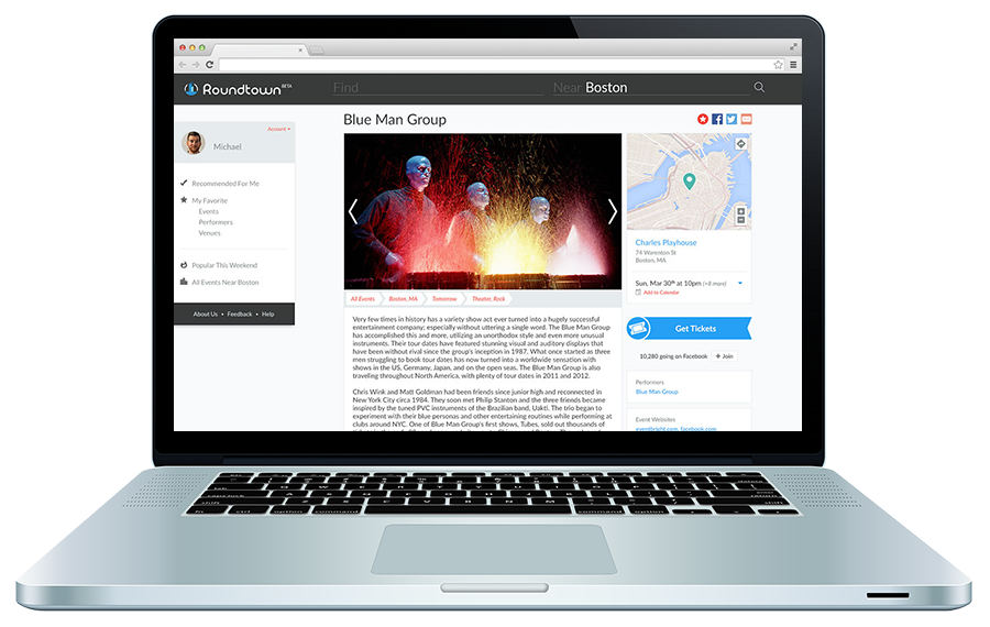
- Adding a large image instantly increase time on page
- Breadcrumbs are more successful under the hero image than above
- Sharing nearly doubles when the buttons are at the top of the page.
- Additional dates/times are distracting from finding the next occurrence
- Thinks the map shows additional events, not the location of the current event
IDEATION
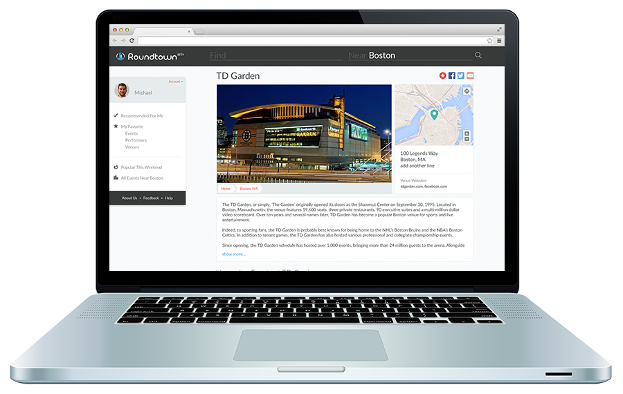
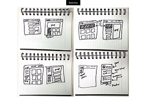
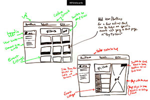
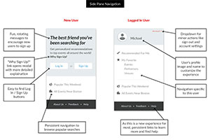
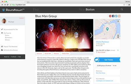
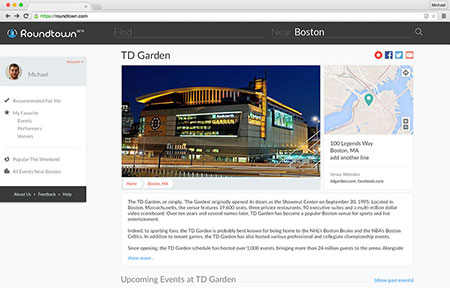
After some discussion, I realized that gearing the site a little more toward a mobile experience would not only be interesting, but familiar to our target age group. I took a few queues from common mobile experiences, and opted to add a side pane navigation. This would stick to the left of the user’s browser window. It worked great for two main reasons: (1) We could put several links here encouraging users to explore the site (2) We could use this area to advertise why a new user should sign up. Many of this info previously lived in the header, but with the side pane we could dedicate the header to searching for events. It also cut down some of the excessive footer links, so we had room to add a graphic of Boston’s skyline, which fit in perfectly with the new site’s style and branding.
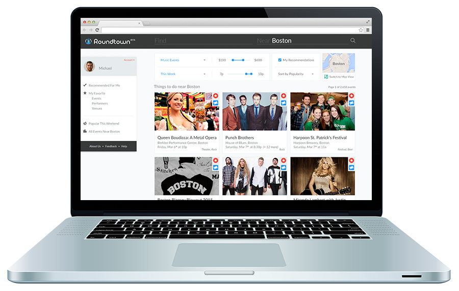
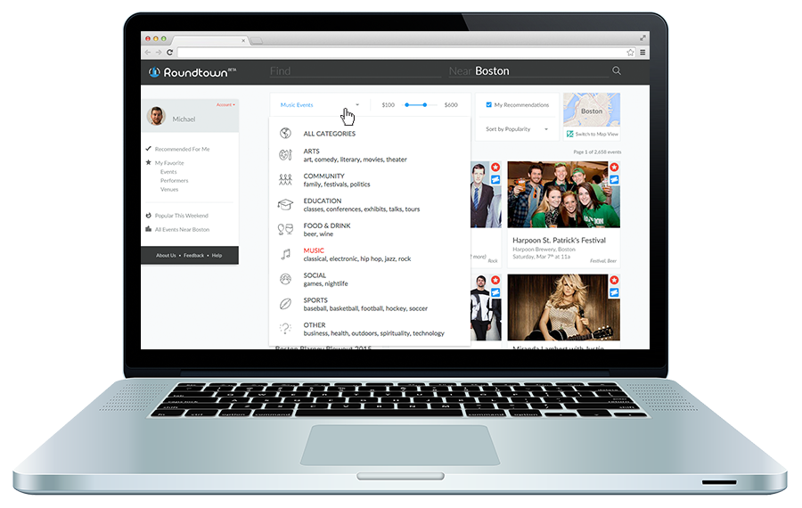
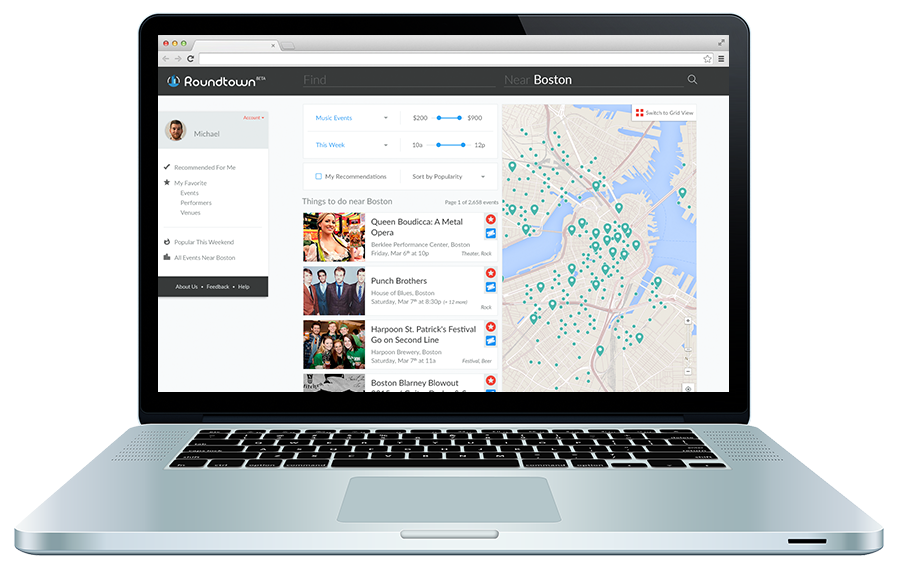
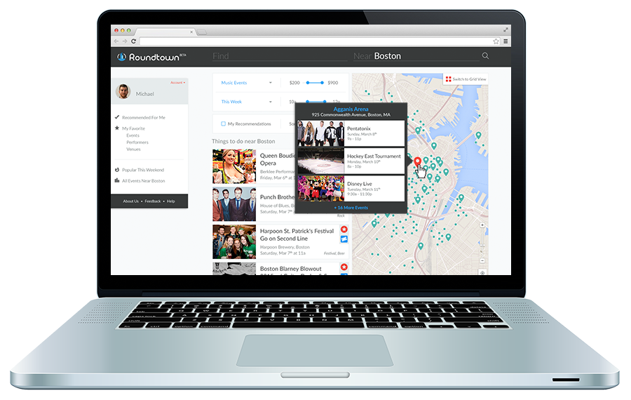
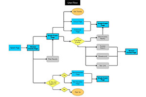
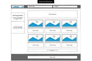
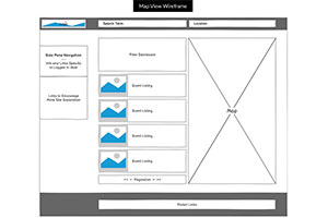
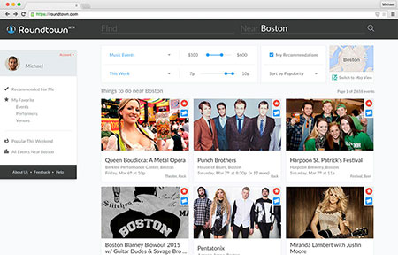
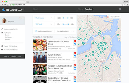
The most important single page on Roundtown.com had to be the Browse Events page. One issue that continued to come up during testing was the small map that showed results. Users either didn’t care about mapping search results at all, or they did, but the map wasn’t big or powerful enough. To solve this I decided to split the page into two views: a grid view, and a map view. Rather than forcing users into a kind of half-there, but not-the-whole-way type of view, we now let users decide. What we found is that users in large cities usually don’t care about the map as much, because of public transit and walkability they just cared if events occurred in a certain radius. Users in more suburban areas were typically driving to events, and it was much more important to them where an event was, and how long it would take to get there.
FINAL DESIGNS
Roundtown’s redesign was a huge success. In just one month following the new site launch we saw an incredible 70% increase in engaged traffic (defined as users that saw at least 3 pages). We also saw about a 40% increase in users register, and users who found us via search engine were sticking around 10% longer.
